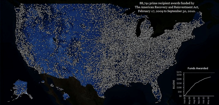
Between February 17, 2009 to September 30, 2010, 88,791 awards have been funded by the American Recovery and Reinvestment Act. This animated map shows where these awards have been distributed across the country month-to-month. Each “light” represents an award.
The weird thing is that this was created by Edward Tufte, who serves on the Recovery Independent Advisory Panel. We tend to associate the name with a certain level of aesthetic, but this is pretty much an out-of-the-box map in Flex. It lacks some of the interaction that we’ve come to expect from online maps, like panning and zooming. When you enter a zipcode, only a barely visible red dot appears. The map isn’t horrible, but it isn’t that good either.
It goes to show how important execution is. You can learn and read about design or have an image in your head of what something should look like, but the only way you can get better is to work at it. Pick up some data and try to do something with it.
[Recovery via @anitalillie]
 Visualize This: The FlowingData Guide to Design, Visualization, and Statistics (2nd Edition)
Yeah, this is definitely a disappointment considering it’s Tufte.
I could also go for the ability to manually move through the time series. There’s an interesting jump in the number of awards, but not the dollar amount, around May of 2010, that I would like to explore in more detail. This visualization defeats any attempt to explore in greater detail.
I agree – a pause button or a slider is blatantly missing…and desperately needed.
I’ve seen a few similar maps an I find them disappointing because they do not tell you what you really need to know. The far more interesting metric is spending per capita– and the more interesting map contains state boundaries. This gives far more useful political information.
This might be a mixture of chloropleth point map and/or density shading.
Pure chart junk. Each dot represents “an award.” The award could be one thousand dollars or it could be one billion or any arbitrary number. Pure spatter.
What sat me back in my chair – despite the award being $1 or $10 million – was the scope and speed at which IA and IN were blanketed with funds. It almost made me forget about the other things this map was trying to tell people.
Pingback: Distribution of Recovery Awards Map | The Big Picture
I remember seeing Tufte a few years ago and hearing how little respect he has for electronic media; Tufte’s own website makes extraordinarily awful use of browser capabilities and screen real estate. He’s an excellent print designer but has never tried to come to grips with the new media.
Perhaps Tufte should have shown the Recovery Act expenditures like Minard’s map of Napoleon’s march into Russia in 1812. Show the flow of money over time and space as it trickles down to nothing.
Share the sense of being underwhelmed with the above comments.
1) Default Flex Loading progress bar is simply lazy and unacceptable. Custom pre-loaders aren’t difficult to implement…
2) I use Flex a lot. But the implicit bargain with the user is the extra overhead–start-up time, plugin required–is repaid in interactivity, drill-down ability, etc. That bargain isn’t upheld here.
3) As a geography guy, for all I know the map is a map of population distribution of the United States. Telling me things happen where people live is not particularly informative. A choropleth map of dollars spent per capita by county over time might have been more interesting.
4) The wrinkle that I actually caught that was interesting was that Iowa and Illinois got a lot of dollars at the outset of the program. Now why would that be? Again, there’s little that helps me further contextualize that information.
If this was the final project of an upper level undergrad course, I’d give it a ‘B’ and explain that for all the work that went into it, there were too many missed possibilities.
Brian
While I haven’t read Tufte in quite awhile, I think many of you, including Nate (who’s work I love), are missing the point. Tufte’s work has always been about simplicity. It’s about communicating one thing at a time in the simplest and most elegant way possible.
What this map shows is that the Recovery Act funds were spent throughout the ENTIRE country. That almost every geographic location with any reasonable number of people received funds. While not the greatest, or even a decent, interactive map, it’s purpose is to communicate the distribution of these funds.
As a side note, one might keep in mind that the audience for Recovery.gov is claimed to be the American people, but it is in reality members of Congress. It is a space where arguments are made and data presented in a manner that is presented in ways that are easily and quickly digested so that information can be used by staffers and others in the context of presentations, speeches, and arguments. At least that’s my take.
Cheers,
Jim
There may be a political goal behind the map that is being well-served by the design. It does show a pretty even distribution of awards by the final time step.
How do you know what even distribution is? As an earlier commenter pointed out, there’s no differentiation between $100 and $100000000. So while the awards may be evenly distributed, there’s no way to tell if the actual dollar amounts are evenly distributed.
Precisely! It shows an even spatial distribution, which satisfies your average news anchor or Joe Public. My impression is that inquisitive folks like those reading FlowingData are in the minority compared to the real target audience.
Unfortunately, this visualization does seem to reflect my opinion of Tufte.
I just did his famous seminar and was extremely disappointed. He did not mention _anything_ about new visualization capabilities available online. And some of his other web suggestions were contradicting any sane approach (e.g. Google News with its hundreds of links is how every website should present its information). Same with his own presentation style – a professor’s drone and ineffective use of overheads (well, he thought it was very effective).
He was also very much into high information density, such as sports pages delivering maximum numbers. No contextualization, no explanations for new users.
I think he had that something special once with the old paper media and did not learn to move or adapt to the realities and possibilities of the new electronic and web interfaces. I would probably be better off listening to a Tableau’s seminar than his.
EPA just updated their mapper for ARRA, using the ESRI Flex API – http://epamap17.epa.gov/arra/
Oh dear lord, that is worse than Tufte’s. Why can’t any of these agencies hire designers?
I believe this is the data behind the map:
http://www.recovery.gov/FAQ/Pages/DownLoadCenter.aspx
Perhaps you or one of your readers can out-Tufte Tufe.
Pingback: Recovery Act Funds NOT being spent accordingly… « The Communicator