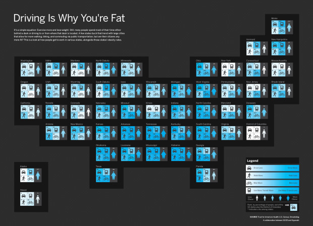
In a collaboration between GOOD and Hyperakt, they come out with a bold statement: driving is why you’re fat. They follow with a graphic that shows rankings by state for amount of driving, walking, biking, and use of mass transit.
Each state is represented by a four-square grid, colored so that lighter indicates more physical activity. Each grid is complemented with a fat/skinny icon, which represents rank for obesity.
I like how the grids are geographically-placed, but I’m not so sure about coloring by rank. Would it have been better to color by the actual metrics the ranks were based on? Does driving a lot really lead to obesity or do obese populations collectively prefer to drive more? Sound off with your constructive comments below.
 Visualize This: The FlowingData Guide to Design, Visualization, and Statistics (2nd Edition)
This is ridiculous, again a problem with correlation versus causation. Let’s think about all of the other factors that are graphed similarly across that same geographic map – such as education, wealth, and urbanisation. Being well educated means you drive less. Driving more means you’re less wealthy. Both of those statements are, clearly, flawed – yet it’s exactly the same logic as is used here.
Studies show people “drive till they qualify”, meaning wealthier people are able to choose to live closer to where they work, meaning wealthier people drive less.
That said, I agree that the visualization leaves a lot of room for improvement.
Not only the problem of causality vs correlation. These are numbers aggregated at the state level. Associations found at a higher level of aggregation may not be present at a lower (individual) level (ecological fallacy).
Furthermore, visualizing the association would improve if a scatterplot would have been used.
Agreed. California walking? Ha. Noone walks in LA. It’s quite sad really. Try to get coworkers to walk half mile to a really good place to eat for lunch, they’d rather drive.
time for a “who can draw this better” contest?
NK: Not to mention; if you drive less you become more well educated! :)
I noticed that Alaska seems to go against the trend, being a bit overweight whilst apparently taking exercise, but then I saw that they watch too much television. Hmmm ……. oh, that’s a train! :-)
Also, you wouldn’t want to open a bicycle shop in Mississippi, Tennessee or Alabama!
This is a poster child for a bad graphic — the kind of graphic where somebody is trying to prove how clever of a designer they are rather than trying to communicate something important.
It might do better if you printed it out on a large piece of paper, but viewed on the web it’s either too close (zoomed in) to see that it’s supposed to look like the U.S. or it’s too far away to see any of the details that support the case it’s trying to make.
A plain boring map of the US with states or counties colored in would do a better job of showing the geographical distribution. A simple 2-d scatter plot of, say, driving distance vs. average BMI would do a better job of showing the correlation: you could throw the geospatial element in here by using different point styles for different geographical regions.
The geographical story that’s interesting is that obesity has radiated out from the South — I’ve heard explanations of that from “driving” to, “right wing politics creates a hostile work environment that deranges people’s metabolisms” to “there’s some chemical in the environment, possibly released by industry that causes people to gain weight.”
I think personally the graphic part is fine. Some broad and informal but nonetheless interesting correlations can be seen at a glance. For me the issue is the sensationalist (and fallacious) title, but if it gets the punters in…I notice that the title of the blog entry uses the same device ;)
I’d like to see the correlation between red/blue states and fat/skinny states. I don’t remember which states are which and the squared “geography” of this map is hard to place some states.
What other correlations go with fatness?
I had the same thought. Vote blue and loose weight?
Other studies have suggested that obese people are more likely to move to where it’s easier to drive, but that also implies that driving (and auto-subsidized/oriented infrastructure) is an enabler and at least partially causal.
While exercise clearly is a contributor, more recent studies seem to place the lion’s share of the blame on diets high in refined sugar, which are more prevalent among poor people, who, historically, were more likely to live in the South.
Given the significant subsidies of agriculture, foods containing high-fructose corn syrup are much cheaper than those without it, so it is increasingly expensive to avoid what some nutritionists now refer to as “poison”. Used to be only the wealthy could afford to be obese. Now, only the wealthy can afford to be thin.
More on this subject:
http://www.ucsf.edu/science-cafe/articles/obesity-and-metabolic-syndrome-driven-by-fructose-sugar-diet/
Can you re-title this “Fat is why you’re driving?”
The title needs to be change. It reflects negatively on whoever comes up with it, even if it’s meant to get a reaction.
I don’t even need to see the graphic.
I think the title should be changed to Fat Drivers are Driving Fatly. That way no causation is implied. And the funnitude factor is increased.
Absolutely true. Useful group is ‘foreign students in the US.’
Similar education level, habits, food – their weight changes as (for example) go to school in Illinois or Indiana, then go separate ways to New York City and Texas. A year is all it takes to gain or lose weight depending on your location.
Or, in the alternative, skinny people walk more.
The legend is confusing. Blue means more for driving and obese, but blue means less for walking, biking, and use of mass transit. It makes more sense with the legend because then people in California walks less, and people in New York and DC walks more.
So can I move to DC to get thinner? =)
Nice chart otherwise.