Charts and graphs have found their way into news, presentations, and comics, with users from art to design to statistics. The design principles for these data graphics will vary depending on what you’re using it for. Making something for a presentation? You’ll want to keep it extremely simple and avoid using a lot of text. Designing a graphic for a newspaper? You’ll have to deal with size constraints and try to explain the important parts of your graphic.
However, whatever you’re making your charts and graphs for, whether it be for a report, an infographic online, or a piece of data art, there are a few basic rules that you should follow.
There’s wiggle room with all of them, and you should think of what follows as more of a framework than a hard set of rules, but this is a good place to start for those just getting into data graphics.
Check the data

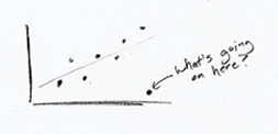
This should be obvious. Data forms the foundation of charts and graphs. If your data is weak, your graph is weak, so make sure it makes sense. Start with some simple graphs to see if there are any outliers or weird spikes. Verify anything that doesn’t make sense. You might be surprised how many data entry typos you find in the spreadsheets people send you.
Explain encodings

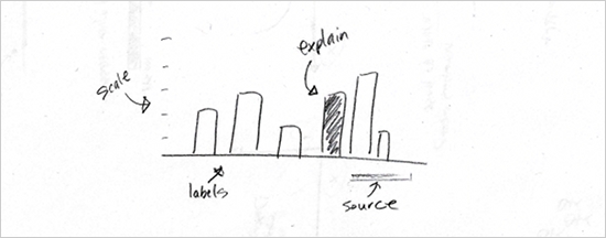
Maybe you use a color scale to indicate magnitude or the size of a square to represent values. Maybe it’s a combination of both. Explain what these encodings are supposed to indicate, and don’t assume the reader knows what everything means. Most likely he doesn’t.
You can provide explanations in a variety of ways, but the most common are providing a legend, directly labeling shapes, or describing your graphic in a lead-in paragraph.
Without your pointers, it’s a guessing game for the reader.
Label axes

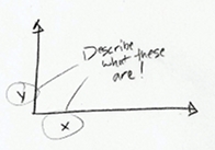
Oh look, what fine gridlines you have there. Without labels or any explanation, they’re just decoration. Label your axes so that readers know what scale points are plotted on. Is it logarithmic, incremental, exponential, or per 100 flushing toilets? Without axis labels, I always assume it’s that last one. Also, in most cases, you’ll want your value axis to start at zero.
Include units

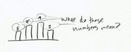
Include some units while you’re at it. If you just leave it with naked numbers, it could mean anything from a percentage, to a volume, to the number of chickens that crossed the road. Again, you want to eliminate the need for any guesswork from the reader.
Keep your geometry in check

If your geometry is wrong, this will be the first thing people call you on, especially if you use bubble size to indicate a numeric value, so you better get it right. You’ll also probably have the pleasure of seeing your work highlighted negatively on some nerdy blog.
Here’s how it works. Size circles and other two-dimensional shapes by area, unless it’s a bar graph or something like that. When you size circles by diameter, you end up with circles that are way out of proportion, and that’s a bad thing.
Include your sources

This should go without saying. Always include where the data is from. You can put it directly in a graphic, or if it’s part of an article, the source can be specified in the copy. This does a couple of things. First, it makes your graphic more reputable, and second, those who are interested can dig deeper or fact check.
Consider your audience

Finally, like I said already, take into account who and what your graphs and charts are for, and design accordingly. You might design a graphic to be super-detailed for a poster that people can stare at for hours. But if it’s for a presentation, you should keep the words to a minimum.
You should probably also avoid Comic Sans, but that’s your call.
In the end, all of these rules can be broken for specific cases, and you’ll learn where you can bend with practice. By no means are these rules absolute.
To put it simply: tell your story clearly and communicate the data accurately. Do that, and you’ll be alright.


 Visualize This: The FlowingData Guide to Design, Visualization, and Statistics (2nd Edition)

Good tips, and nicely illustrated!
bud these look like they were drawing by a 5 year old
Great tips, don’t forget the ‘choose the right format’ though. There are to many bar charts that should be lines or columns and vice versa.
Great Post – only one i would add is “compared to what?” Try to always consider the context: “Sales were up 99%” – “compared to what?”. Answer might be “vs Last Year”, “vs Forecast” or “vs Northern region” etc a good chart should answer this
Tim Kent,
Absolutely, 100% agree with you on that one. Context gives graphs the ability to reveal insights.
Nathan, great post!
Some rules I think worth mentioning (and which I see violated quite a bit are) are:
Bar charts should have an axis with a zero baseline.
If you’re charting categorical data on a bar chart, it’s usually best to put the categories on the Y axis so that your readers don’t have to struggle to read the categories.
Stay away from 3D, it’s great in real life, but on the computer screen it makes your graphs more difficult to read than “standard” graphs.
Thanks, John. I wouldn’t say stay away from 3D all the time, but yeah, in a business setting, it’s typically a bad idea.
bud bud naaaaaaa
Nice. This has become a pearl on my pearltree! :)
Nathan,
This is a great list. You inspired me to (finally) post my short list of how to create good information visuals over at O’Reilly Answers.
For an even deeper look at the design process of information visuals, check out my master’s thesis on this very topic.
Cheers, Noah
@Noah – nice!
Pingback: “7 Basic Rules for Making Charts and Graphs” | Larry Ferlazzo's Websites of the Day...
Very clear tips for creating better charts and graphs. Would love to see more people thinking like this, especially when they embed charts into PPt. (Sooooo hard to read ’em sometimes!)
Great clarity – love this post (as well as all of your content). Edward Tufte would be proud. He once said (and I am paraphrasing) that a chart without a source reference is a lie.
It may seem obvious to those who read graphs easily (not me) but I would also appreciate having a frame of reference to compare results to. What is the average or last years results? And even with these in front of me I will struggle to fully comprehend the graph. If you tell me it’s from a total of 100, I can see it as %. Or if you say that last year the score was 25 and now it’s 20, I can see a decline.
Absolutely love the illustrations! Unique and memorable!
@Annie – I’m glad you like them :)
From an individual that has used charts and graphs for years in the field of accounting, you bring up excellent points here. This is clear and succinct. I would encourage all statistic profs to incorporate this into their beginning stats courses and make it a requirement for all business courses.
I wish this was presented to me years ago at the beginning. Thanks for your profound words on this important topic.
Love the fundamental nature of this. It should be read by anybody before starting a chart or infographic. Bookmarked.
“Size circles and other two-dimensional shapes by area, unless it’s a bar graph or something like that.”
Um … that’s either wrong or just very poorly worded. Bar graphs should be sized by area as well. That may be equivalent to sizing by height, but if there’s ever a difference between sizing a bar chart by height or by area, area should win. That’s not what you’re saying there with the word “unless”.
Pingback: links for 2010-07-22 « Boskabout
Pingback: Coffee Spoons › Rules Exist for a Reason
Pingback: VizThink Blog » Blog Archive » VizLinks | Visual Thinking Bookmarks for July 22nd
Instant ⌘P then displayed to the team. Thanks for the nice lesson
@gabyu – glad it was helpful!
Pingback: 7 Basic Rules for Making Charts and Graphs | joelotz.net
Pingback: 7 Basic Rules for Making Charts and Graphs « The IT Blog
Pingback: 7 Basic Rules for Making Charts and Graphs | DiPot: Ice Tea tech
Pingback: My Latest Diigo Links (weekly) : Electric Chalk
Pingback: 7 Basic Rules for Making Charts and Graphs | Michael Michael
Pingback: BCM301
Nathan,
Very well done! I always look for good tips regarding chart creation and I put attention to all of these details. Your post keep me in track of doing the right thing. I would add that we should avoid to add extra colors to bars in a chart, just using one color and without border lines in the bars help to keep the visualization effect right.
Cheers!
Pingback: 31.07.2010, 7 Basic Rules for Making Charts Right « graphs-of-the-day.com
Pingback: Curious Cat Management Improvement Blog » Management Improvement Carnival #105
Your illustrations are priceless. I’d love to be able to use that style in presentations we do… Are they all hand drawn? Did you just scan it in?
@Brook – Yup. Not quite works of art, but good enough to the point across :)
Could you advise on the best, low-bar graphics programs kids can use to create infographics? I don’t want the purpose and tasks of making infographics getting bogged down by tech challenges. I’d appreciate everyone’s advice.
@jane dont let kids make infographics
Pingback: Misrepresentation of Data « Doctor Crankenstein
Pingback: ToolBlog » Die Checkliste für Diagramme
Excellent post! If I could add:
From a design perspective (and audience), make sure that if you use color, it is also discernible in black and white. I had a chart for my boss once with red and green columns, and he took one look at it and said “This is nice, but I’m colorblind.” You never know how it will be displayed or printed after it leaves your hands, so try to use as much contrast as possible. My 2 cents…
Hi Nathan – I am new to this forum. Just going through all the archive posts. Really nice article.
If possible, Could you please share some of the dashboards that you have created or you suggest people to refer them as good dashboards considering all data Visualization rules.
Pingback: Internet Librarian 2010 – Resources | Yankee in Canada.com
Pingback: Cairteacha agus Graif « MA Pleanáil Teanga 2010
Pingback: 7 basic rules for making charts and graphs | QuantMinds.com
Great rules. Would love to see them followed in the graph types supported on your.flowingdata.com. Just sayin’.
Pingback: Assignment Information Design | Katherine Dillon
very well illustrated! I would say its a must read