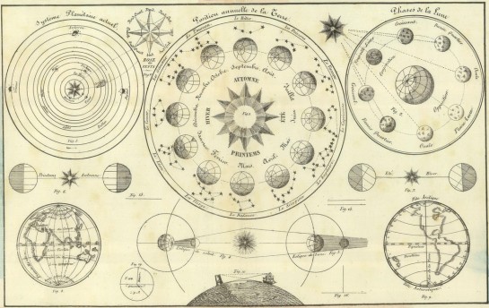
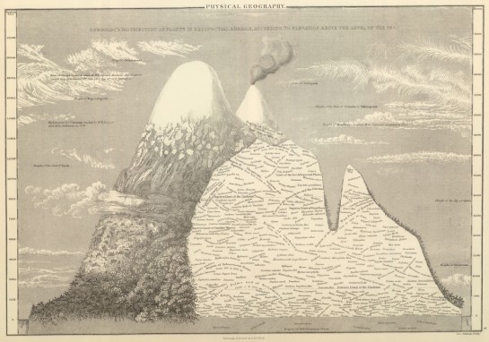
Old graphics are awesome. We saw some from the 1930s already. These are even older.
Other than the maps, I don’t exactly know what I’m looking at (knowing French would help too), but who cares? Mmm, hand-drawn goodness.


[Thanks, Harvey]
Old graphics are awesome. We saw some from the 1930s already. These are even older.
Other than the maps, I don’t exactly know what I’m looking at (knowing French would help too), but who cares? Mmm, hand-drawn goodness.


[Thanks, Harvey]
The French infographic is in fact a history of the world, starting from the Greeks and the Chinese, and on the left and right there are mentioned older civilizations like the Eqyptians and the people who built the tower of Babel (top-right). The flows on the map show how ’empires’ or civilizations developed and how they disrupted the development of others. On the left you can see how the Germanic civilization grows and replaces the Roman republic.
On the bottom half the print is too small but it is probably more of the same, monarchy-wise this time!
That civilizations chart is really cool – I have a modern looking version of it, but this is way cooler. I would add that the horizontal axis refers to geography.
Is there a larger version so I can read the detail?
yup – visit the original post at bibliodyssey (linked above).
That top graphic looks just like the Wall Chart of World History by Edward Hull. It seems to be out of print now, but I got mine for my birthday in 1990 and often wish I could add the last 17 years to it!
http://www.amazon.com/Chart-World-History-Earliest-Present/dp/B000XYL60G
I’ve always enjoyed Bibliodyssey. He is really meticulous and unearths some really cool gems. Speaking of the 1930s infographics did anyone ever find a copy of that book in print anywhere for sale?
The French title reads “Chart of Universal History: From Creation through Today.”