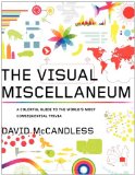
David McCandless’ The Visual Miscellaneum: A Colorful Guide to the World’s Most Consequential Trivia hit the shelves last week (in the US). As I flipped through 320 pages of original graphics during my flight from New York to California, I thought to myself, “FlowingData readers are going to love this.”
What It’s About
 I’m sure you’ve seen some of David’s work by now. He’s been posting graphics at Information is Beautiful during the past few months, leading up to the book release and recently started doing a weekly graphic for The Guardian Datablog. The book is like that, but much more of it.
The Visual Miscellaneum has about 100 original graphics designed specifically for the book, and yes, it is very miscellaneous. On one page is a comparison between scientific consensus and skeptics of global warming, and on the very next is a chart on dictators’ wives.
Not Just Charts and Graphs
If you haven’t figured it out by now, many of the graphics in this book are very tongue in cheek, but at the same time, they’re quite informative.
I really just had fun flipping through the pages. I felt like I was learning something new and interesting with each graphic, and while random, they seemed to be linked somehow. It was kind of like when you look something up on Wikipedia and one hour later, you find yourself reading about types of beards (yeah, there’s a graphic for that). Speaking of which, a lot of the data come from Wikipedia and other open data sources, so after you see David’s graphics, you can go and try things out on your own.
With that said, not every graphic is perfect. There were a few where I wasn’t sure what I was looking at or it took a little while for me to process, but that’s what I was expecting. Many of the graphics are probably experiments in design more than they belong in a Tufte book, but I’m all for experimentation, as I’m sure all of you know.
Bottom Line
I liked The Visual Miscellaneum a lot. It’s fun, it’s interesting, it’s informative, and it’s enjoyable.
P.S. One quick note. It says “hardcover” on Amazon, but really it’s more of a thick paperback. Just so you know.

 Visualize This: The FlowingData Guide to Design, Visualization, and Statistics (2nd Edition)

Funny that you blog this today, b/c I found this book in a book store myself yesterday and was flipping through it all evening. Every page was very interesting and kept me busy until I was all the way through.
Nice collection indeed.
I received my copy in the mail last week and the book is beautiful! I also loved the little “Critics Say” blurbs at the bottom of some of the graphics so that you could also feel like you were viewing them on the internet and seeing the heroic comments that people leave.
I’m kind of new to the whole concept of alternative data visulisation techniques, but driving it forward in any medium can only be a good thing!
As a happy owner of such compendiums as Schott’s Original Miscellany and The Weekend Book (reissued in all its 1920s glory), I go weak at the knees at the prospect of browsing The Visual Miscellaneum. Where else but in David McCandless’s Guardian blog would I have seen the UK budget deficit shown so accurately as a black hole in the graphic?
Pick me, ooh ooh, pick me!
I’m incredibly excited about this book! His blog, Information is Beautiful, has a great display of data visualization, and I’m excited to see this compilation of graphics.
So much of getting better visual explanations relies on having more people knowing them when they see them and pushing in that direction. Imagine what windows would look like without the Mac to set expectations, or where we would be without Tufte’s examples, or the fine folks at the NYTimes.
So these books, even playful ones, help all of us float on a rising tide.
I look forward to both reading David McCandless’ book and leaving it on my desk for others to find.
Pingback: 8 Great Gifts for Your Data Geek « Earth to Bobby
Pingback: Book Review: The Visual Miscellaneum | Vicki Boykis