I admit it. I’m a sucker for animated maps – especially when there’s music playing in the back. I’m not exactly sure what it is about them. It’s data visualization over time and virtual (or physical?) space fast forwarded and rewound. It’s like I’m a supreme being looking at changes over time, peering down from above. It’s intuitive. It’s very visually linked with the real world, and that’s probably why I chose Britain From Above as the best visualization of 2008.
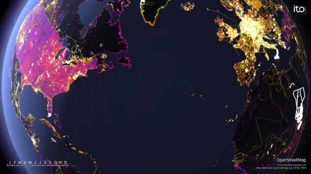
ANYWAYS, check out this animation by ITO that shows the edits to OpenStreetMap, a wiki-style map of the world, over the last year.
Find high resolution pics at the Flickr photo pool.
[via visual complexity]
 Visualize This: The FlowingData Guide to Design, Visualization, and Statistics (2nd Edition)
Pingback: A year of OpenStreetMap edits — Raquo Journal
Very cool video, and I agree that Britain from Above is the best visualization series from 2008. The most amazing part to me is seeing the taxi traffic throughout a day in London, knowing that the individual drivers, acting in an uncoordinated, unplanned way, still move in a remarkably efficient way, covering all the major arteries of the city.
If you haven’t seen it yet, watch it here: http://www.bbc.co.uk/britainfromabove/stories/transport/taxisrushhour.shtml
Thanks, Justin. I hadn’t seen the taxi one yet. It was a treat
Pingback: Brent Fitzgerald / Life & Research Notes / Blog Archive » Open Street Map: A Year of Edits
Pingback: Jenna’s blog
god, how much do I love this, watched it so many times. Especially with my own fascination with maps.
Thanks for sharing this, have shared on with many.