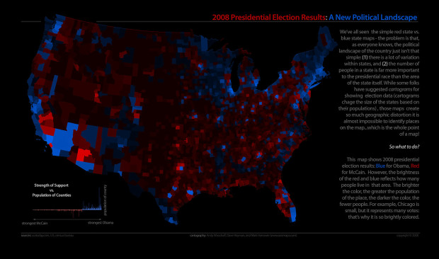
The thing about cartograms is that it’s hard to make out what you’re seeing. You lose most sense of geography and size comparison is near impossible. They’re more of a pretty picture than an analytical tool. Axis Maps proposes an alternative to cartograms, and the example of course uses presidential election data.
Instead of morphing counties so that they are sized by area, Axis uses transparency or more accurately, alpha levels. Uh, wait, is that more accurate? Oh I dunno. Someone correct me if I’m wrong. Anyways, as a result, counties with higher populations glow brightly and those with smaller populations fade into the darkness that is oblivion. I like it. More importantly though – what do you think?
[via Cartogrammar]
 Visualize This: The FlowingData Guide to Design, Visualization, and Statistics (2nd Edition)
I agree that the shape distortion in a cartogram takes a bit to get used to. You sure couldn’t use one for navigation.
But that’s not their purpose. They are intended to show information on a different demographic basis than merely geographic area. For this I find them rather effective.
The intensity based system is also interesting, but I feel it’s less effective. For one thing, using colors, or shades of colors, is less effective than most other means of representing quantitative data. Red and blue are clear, since the electoral college makes presidential elections an all-or-nothing proposition.
I agree, that cartograms are too disorienting. The best population/electorate map I’ve seen, though, is at http://www.culture-making.com/post/they_vote_by_night. They mashed up the NOAA “US illuminated at night” map with the University of Michigan’s blue-purple-red electorate map. A really simple and elegant solution to showing population density and electoral info.
‘using colors is less effective than most other means of representing quantitiative data’ is false. Lightness is the visual variable used to indicate population density on these maps (re: Bertin’s 7 visual variables) and decades of user testing has shown that lightness and size are by far the best variables for ratio/interval level data: by ‘best’ I mean most easily seen as rankable, most quickly and accurately orderable, and small differences are easily perceived (I’m talking about lightness, not hue or saturation).
I’d have to disagree with you Jon. I think the intensity/transparency maps more quickly pull your attention to the areas of population. And, consequently, areas of little population. That’s the whole point, right? In an instant, you can determine which counties (in this case) have the most and least population. I think this transparency map is great.
Right off the bat, I had a negative gut reaction to color mixed with transparency. With the least populated counties, you can’t even tell which color it is. But that’s the point. There are such few people living there that it didn’t have as great an effect on the election. Which brings up another point. Each state gets its own Electoral College votes. I propose a slight edit to the map. Rather than having one scale of transparency, there should be 50. This would more accurately show how each county affected that state’s Electoral College vote, rather than the national general public vote, better representing how elections are determined.
What do you think?
This is a powerful representation. Better than any picture I’ve seen, it illuminates a profound concept that the authors of the U.S. and state Constitutions worked hard to make real: protection against the ‘tyranny of the majority’. It is what brought down the Greek democracies long ago. So, we have two U.S. senators from every state and at least one state senator from every county, regardless of population. The value of this image is that it shows how much of the country would be politically powerless but for the wisdom of the founders.
Wow, I seem to be the contrarian. I guess that’s how I’m supposed to drive traffic to my own blog, if I knew what I was doing!
Regarding brightness or shades of a color, I need only refer to the image on the bottom of the first page of Stephen Few’s Practical Rules for Using Color in Charts. This shows how a single shade of a color (gray in this case) looks completely different depending on what shades it is surrounded by.
Here’s a specific example here. If I look at the region around Detroit, and the region that is northeast of LA and extends into Nevada, they appear the same shade of medium blue, although I can’t really tell, because they are separated by a lot of distance and surrounded by different colors. Intensity is only a measure of population, right? Not of strength of the vote in favor of either candidate? Does this mean that the two regions have the same population?
My first inclination is to try mentally to relate color intensity with population density or with strength of the vote, and even knowing that color intensity is supposed to be population, I do not find it easy to assimilate the information. I am not saying this visualization is not effective, I merely think it is difficult to interpret correctly.
The idea to express density or “local weight of the color” by color brightness seems reasonable, but it is terribly hard to get right.
I wonder how that mapping was done: linear? logarithmic? How do you give half-sized area the same “weight”? Also, you are modifying visual saliency a lot by these contrast difference, essentially highlighting small and dense states. Justified? Overall I am not convinced. The whole idea of cartograms is to compensate for the differences in density by scaling area. I am not sure if there really is a proper way of achieving a similar effect with another visual variable and unchanged areas.
Nice job.
I think of the cartogram as a “homunculus” – those distorted human forms that represent somatosensory sensitivty in the human body – big faces, eyes, tongues, and hands. But creepy and hard to get past to see the real info. A human form with color intensity of red representing skin sensitivity or motor control might be better.
One suggestion, though: what you are calling “transparency” is really just a variation of coloring. I would prefer to use the idea of “saturation”. Which is similar. So, for instance, pure gray would represent no particular leaning, while bright blue would be total democrat and pure red would be total republican. You’re using black instead of gray (or instead of purple, which we have already seen).
If you have studied Edwrd Tufte (highly recommended) you know about the ways that color can be used to deliver information. Hue (rainbow spectrum) is best for showing different “kinds” of things (like political affiliation), whereas saturation or brightness is good for representing the amount or intensity.
At any rate, I’m glad that people are giving alternatives to these “maps that lie”, which the mainstream news media keeps throwing at us.
-Jeffrey
Moritz, I am uncertain what exactly you mean by this: “Also, you are modifying visual saliency a lot by these contrast difference, essentially highlighting small and dense states. ” Highlighting small and dense states is part of the point, and it is essentially what a cartogram would do too, right?
The debate over the effectiveness of this map brings up a lot of interesting suggestions for variations. Keep watch at the Axis Maps blog and I’ll try to post a few different ways of slicing the data. In the meantime, it’s good to see some good old fashioned cartographic discussion here. (And we definitely appreciate the link, Nathan!)
Andy –
Good blog by the way. Very interesting work.
Thanks, Jon, and thanks for getting conversation(s) going on our site too!
@Andy: Essentially, I meant there is a thin line between compensating for not enough space on the map, given the population and overrepresenting the relative importance of California/East coast states. I would not know how to map size compensation to difference color value, and I am not sure if there really is a proper way to do it, given, e.g. the mentioned context-dependency of brightness perception.
As I think on Andy’s and Axis maps’ visualizations, I begin to interpret their maps as follows:
Take the amount of blue or red ink used in the distorted cartograms, and spread it over the undistorted state’s area. California and the Northeast remain deeply colored, while the Midwest is lightened.
It’s a convoluted way to get to the transparency maps, but it works for me, since I’ve already internalized the cartograms and their unique distortions. (I recall seeing the homunculus diagrams as a fairly young child, 6 or 7 years old, and knowing right away what it was showing. Whatever happened to that smart kid?)
I suspect that if the background were white instead of black that it might have been easier to take in at first glance.
Pingback: An Undistorted Election Results Map | PTS Blog
So, we have two U.S. senators from every state and at least one state senator from every county, regardless of population.
Actually, that’s not the case.
I do like this map, but I think one problem is that you scaled the brightness to population, rather than population density. I think this makes places like San Bernardino County, California, or Maricopa County, Arizona, look more influential than they are.
>> So, we have two U.S. senators from every state and
>> at least one state senator from every county,
>> regardless of population.
> Actually, that’s not the case.
It’s not? What’s wrong with the statement? It’s incomplete, because DC also gets one representative, and some territories have delegates.
I guess I need a new graphics card, but that map was virtually impossible to see, it being black and all that. Perhaps a different color scheme. Basically I gave up on this one.