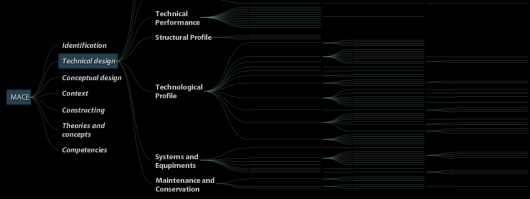
Moritz has been working on visualization of a hierarchical glossary carefully named “Glossary Visualization” versions 2-5. Not sure where version 1 is. Being a network graph, I can see this getting chaotic when there are more words (or categories) involved, but then again, maybe that’s all the words. In either case, it beats browsing through words in a dictionary; although, these prototypes don’t include definitions yet.
In the most recent version, words are represented as a DOI tree showing only the categories. Click on a category and view the sub-categories.
All four versions were implemented using the recently-mentioned Flare visualization toolkit.
What do you think – cluttered or just right?
 Visualize This: The FlowingData Guide to Design, Visualization, and Statistics (2nd Edition)
Hey, thanks for linking. Version 1 never really worked, so made a fresh start with version 2 :)
Ah nice! I am in an eerily similar place compared to you. Trying to learn up ActionScript & Flare when there is a deadline looming ahead. Have you come across any visualizations that were open source, so that we can get a quick hang of some of the design patterns followed?
Pingback: Jenna’s blog » MACE interface demo