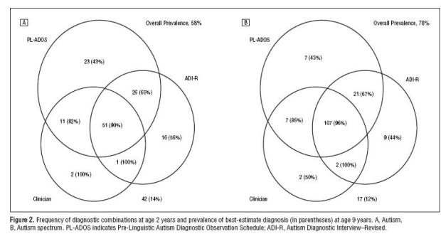
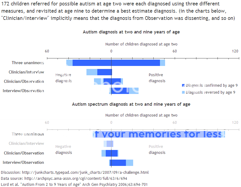
This venn diagram showing results from tests for Autism really seems to be making its rounds lately. It began with Igor Carron asking on his blog if there was a better way to display the data. Then Andrew Gelman put something of a redesign challenge up on his blog, and after Andrew, the challenge headed on over to Junk Charts. Redesigns are flying off the wall! From bar, to mosaic, to tornado charts, there’s clearly many ways to represent data.
Which one is the best? It’s hard to say, because they all have advantages and disadvantages and the answer really depends on what point you’re trying to drive home.
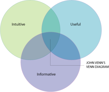
However, I can find one advantage that the original venn diagram has over its redesigns — it’s intuitive for many people. John Venn introduced his diagram in 1881, over a century ago. That’s a long time for people to adjust. People understand it. It makes sense. Yes, this particular venn is really ugly and probably didn’t belong in a Powerpoint presentation, but doesn’t it say something that re-designers were able to read it and use the data it provided? I think so.
So in the spirit of Indexed, here’s to you Mr. Venn.
 Visualize This: The FlowingData Guide to Design, Visualization, and Statistics (2nd Edition)
Great article. Venn diagrams have really become an important tool for displaying data over the years, and it is pretty impressive to see how people are using them. I would agree with you that the top diagram is not very attractive, but if others were able to understand it I guess it served its purpose.