Unbelievably, I’m already in my sixth week, with this week practically over. I create graphics more efficiently (although I’m still constantly learning) than I did in my first week and have gotten a better idea of The Times style and the process of how a graphic gets put into the paper. Here’s my last three graphics that have run in the paper.
Convincing Data, sort of
This past Sunday, the Real Estate section had a story on the rising Manhattan apartment prices and the declining apartment inventory. The Manhattan trends were then compared to national housing inventory, which shows (somewhat) of an increase, opposite that of Manhattan.
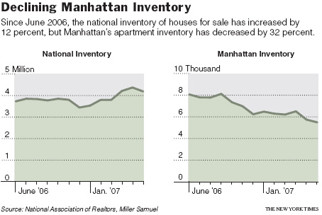
I wasn’t especially excited about graphing this data, because I wasn’t sure how confident I was in the national inventory estimates. Is national housing inventory really increasing? On the order of millions, a small move up or down in the order of thousands could drastically change how that line looks. I had Manhattan inventory data though, and it at least looks like something is going on there.
Timeline of Mean Men
If you read the news at least a little, you’ve most likely heard of the horrible Newark killings on August 4. There were three men and three boys who are (were) a small a gang, and they killed three and wounded one. This worthless-to-society suspects lined up the victims against a wall and shot them in the back of the head, execution-style. Un-fricken-believable.
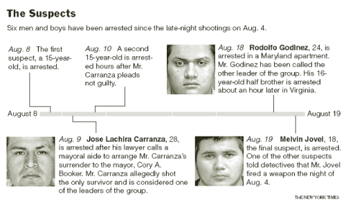
You would think a timeline would be super-simple to make, but I’ve actually found them the most difficult. First there’s research to find the dates and make sure I got accurate information. Then I had to organize everything in a way that was readable and looked decent. Finally, I had to find pictures (that I was allowed to use), get them toned by the art department for the paper and the web, and then let the copy editors reword everything so that it all sounds better. It’s quite the process, and there’s clearly a lot of style issues. At least with graphs, there’s some familiarity there.
Percentages Instead of Counts
Stacked bar charts are a little tricky. They’re not always especially easy to read if you’re interested in showing information from all categories. It’s especially difficult to see changes when the height of each complete bar is changing. However, when the focus is on a specific category and all the bars are the same height (e.g. each group of stacked bars add up to 100), then I think it’s OK.
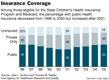
In the above graph, I think it’s easy to see the changes in public health insurance, and with some careful labeling, it’s not too hard to make out the changes across the other two categories.
So yeah, really varied topics, which is good for my short attention span. I’m still waiting on a call to do a sport graphic though. The Times doesn’t seem to have a whole lot of graphics in its Sports section. I find that a bit odd. I would think that sports would naturally lend itself to graphics with all the statistics getting logged every day. Maybe the sports audience doesn’t want to see stuff like that?
 Visualize This: The FlowingData Guide to Design, Visualization, and Statistics (2nd Edition)