It’s easy to see how Statistics got this bad wrap because it’s so easy to lie with data, charts, and graphs. Sometimes it’s on purpose — someone might try to present “good” results that actually suck. Sometimes it’s accidental — someone might have misread or didn’t read the documentation that came with the data. In the case of Swivel’s most recently featured graph, it was the latter. A case of mistaken identity so to speak.
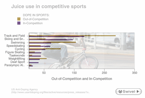
The data about doping tests in sports came from here. Now the graph on Swivel would have you believe that the data represent the number of doping cases found in each sports; however, according to the USADA report, the data is actually the number of tests the association conducted inside and outside competition during the first quarter of this year. The report contains no data on the USADA’s findings.
What We Learn
What can we learn from this? It’s great to visualize data, but you have to be careful. Read the documentation. Find out what the data is about, because without context, the visualization or any findings are practically useless. Statistics isn’t to lie. In fact, it’s the exact opposite. Statistics came about and exists today to reveal the truth.
 Visualize This: The FlowingData Guide to Design, Visualization, and Statistics (2nd Edition)
Pingback: FlowingData / Why I Do Not Swivel Data