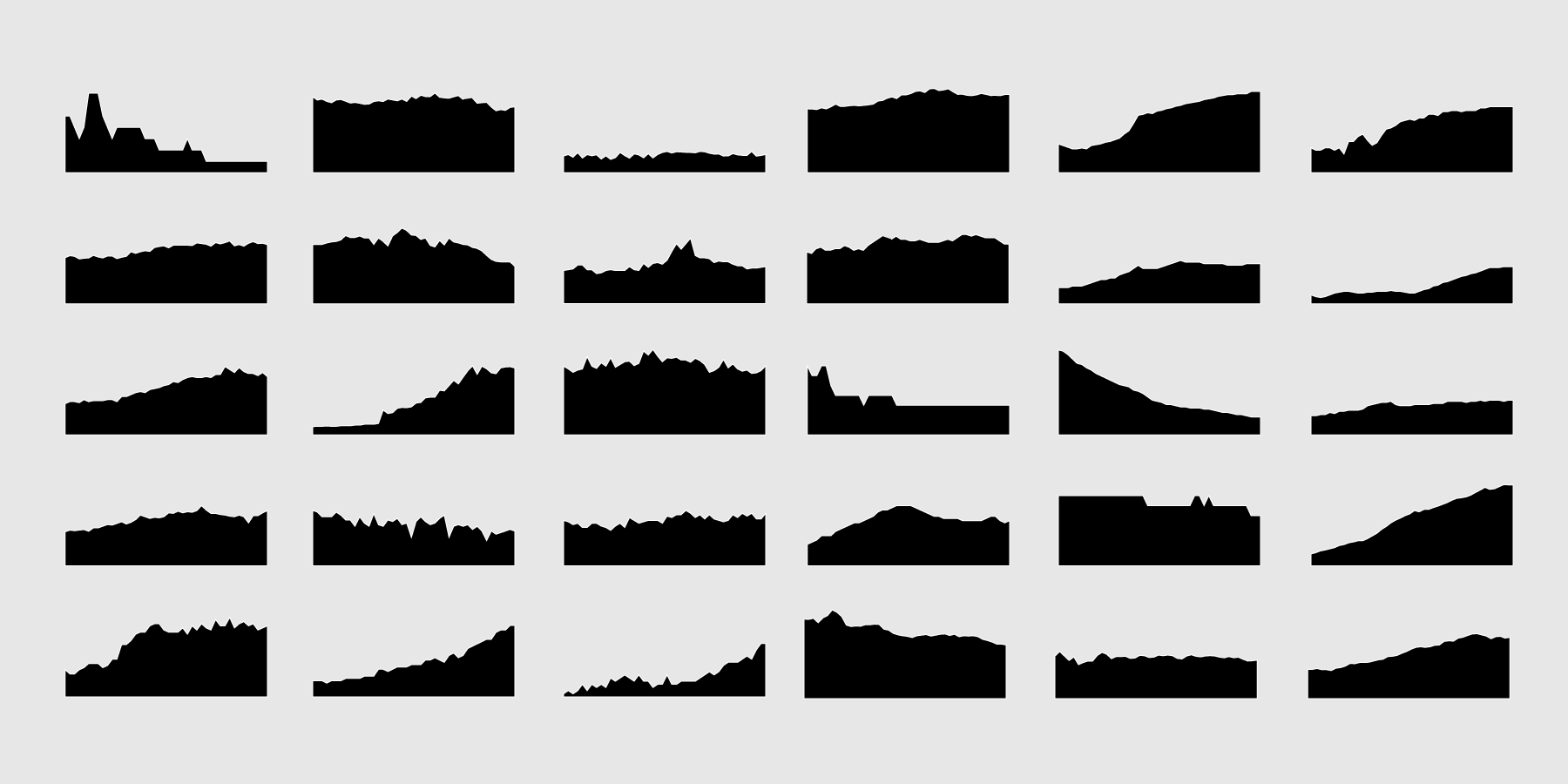
It’s often fun to explore time series data, because much of it is inherently intuitive. We have a sense of how time passes and how things change. From a visualization perspective, we can see the magnitude of that change and communicate to others in a way that is easier to process.
Recommended Time
One week. Or, fit it all in on a weekend and get back to work.
Learning Objectives
Get you charting time series data as quickly as possible. Cover the basics first and then move into more advanced things like animation.
How to Get the Most Out of This
The course is structured for roughly 8 to 10 hours in a week, depending on how much time you want to spend with each section. Go through section-by-section to start from basics and work towards more advanced visualization.
When you work through a tutorial, download the source first and follow along rather than entering every snippet in R. For simple examples, it’s easy to copy and paste code, but when you get into more complex examples it’s easy to enter typos or get the code structure mixed up. Here’s what code will look like through the course, which is typically a cue to enter something in R:
# This is code.
paste("hello", "world")
Outline
Getting Started
Install and setup R in a few easy steps.
Basic Chart Types
Quick charts. Very little code.
Categorical Time Series Charts
Compare multiple time series at once to see differences and similarities between categories and groups.
Multiple Variables
Maybe you want to see more than one thing in a single view over time.
Animation
Make it move.
Adjusting for Presentation
For when you want to communicate what you found to others. This requires more care and polish than making charts just for yourself.
Stumbling Blocks
Don’t get stuck in time.
Your Guide
 I’m Nathan Yau. I have a PhD in statistics from UCLA, with a focus on visualization for presenting data to everyone. My visualization work leans towards analytical but has also reached millions of people. Find more about me here.
Membership

Become a member on FlowingData to get full access to this course and others, plus hundreds of tutorials and guides. Learn to make any chart, the process of data design, and how to communicate with data.

