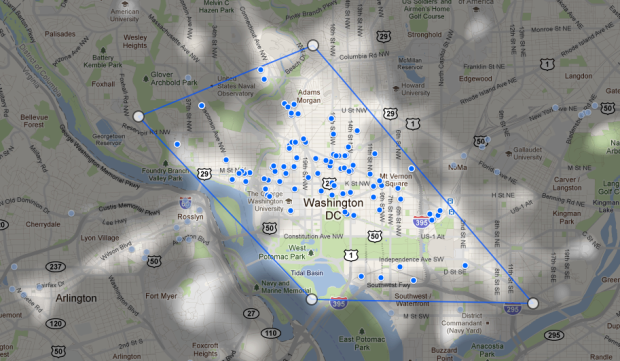
When you’re picking a hotel to stay at in an area you don’t know well, the place you end up at can be arbitrary. With most travel sites, you get a list of hotels with ratings, which is helpful, but still feels confusing at times. Sites like Hipmunk aim to make the search easier. Most recently Google launched a new experiment called Hotel Finder.
Enter a location and date range you want, and a map highlights the areas that are most popular. What makes an area “popular” I’m not sure, but you can see how this could be helpful (or not). The Hotel Finder also offers additional filters in the forms of sliders for price, time, and rating. Unfortunately the highlighted overlay doesn’t dynamically update yet.
But let’s go back to the meaning of popular. This is the most important bit. Are areas brighter where more people stay? Do they stay in these areas because they’re cheaper or because they’re nicer? Is it based on searches? Why are some areas with no hotels highlighted? So many questions, too few answers, and you could very well end up in some stink hole. You do get more details on a hotel when you click on one, but that defeats the purpose of the map view.


 Visualize This: The FlowingData Guide to Design, Visualization, and Statistics (2nd Edition)

based on that map of dc (as i live here), the highlighted areas look like they are the most heavily trafficked touristy areas
Poking around the map of my home base (Denver, CO) it looks like maybe “popular” has nothing to do with hotels, since many white hot spots have no hotels whatsoever. I’m guessing they are deriving the heat map from keyword searches on activities? In the case of empty spots in Denver it looks like hiking, scenic overlooks, small town dining, etc.
Yeah, I’m quite curious to learn what Google is using to define a “popular area”. If anyone knows, please let me reply to this thread with the answer. Thanks!
Nice tool that has potential but I am not sure how it is an experiment. I would have overlaid filters for restaurant ratings. I wouldn’t be surprised if we see similar tools pop on Kayak and other discount travel sites. As for the popular areas, it looks like they may have correlated the amount of picture tags in maps to being “popular”.