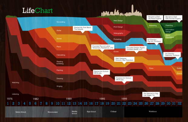
Ben Fogarty uses a stacked area chart to represent his life. To us outsiders looking in it’s not much more than that, but to Ben I am sure there is a story in every peak and valley. It’s like a “this is your life” slideshow in data.
This is the drive behind your.flowingdata. I don’t think YFD is even remotely close yet to developing a personal narrative, but it’s something to shoot for. I can imagine a lifetime of data replaying and watching it unfold like a movie. That’d be amazing. Then again, I might also end up like Jerry in Act 3 of Episode 88 in This American Life. Fingers crossed for the former.
[via WeLoveDataVis]


 Visualize This: The FlowingData Guide to Design, Visualization, and Statistics (2nd Edition)

I like how “storytelling” ends up looking like a lake and a river.
It’d be pretty cool to look back on your life with a chart like this. Seeing how much time you devoted to certain areas might help you decide what’s important and allow you to change your behavior, too.
Pingback: Planner Reads » Blog Archive » One Life, One Stacked Area Chart
I had to smile how “Listening” was non-existent right around the time he got married. =)
Great visual. Now I just need to build about 10 million of these for our customers and see what the rollup looks like. Bet there’s a bit more TV in the mainstream.
Pingback: Moonlit Minds « Moonlit Minds