A series of three interactive and animated visualizations that show the uncertainty of life at both the individual level and the population as a whole.
 Years You Have Left to Live, Probably
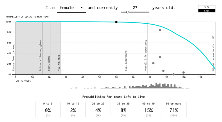
This simulation is based on life expectancy data from the Social Security Administration and shows how many years you have left, based on your gender and age.
 Causes of Death
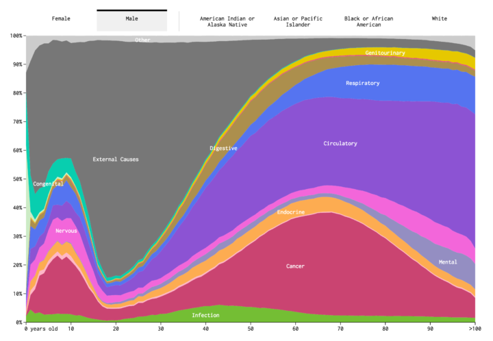
An interactive stacked area chart shows how Americans usually die, by age.
 How You Will Die
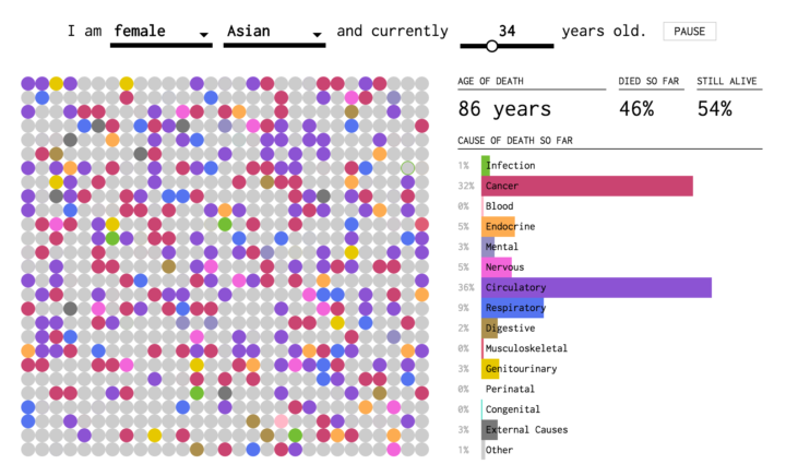
In a combination of the first simulation and causes of death, this simulation estimates when and how you will die.

