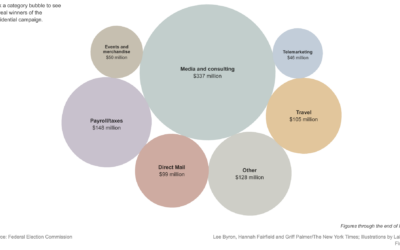
The New York Times shows how presidential candidates have spent more than $900…
Design
Important in presenting data clearly and beautifully.
-
Playful Infographics Triumph Over Pure Analytics (Sometimes)
-
Why Should Engineers and Scientists Care About Color (and Design)?
I studied electrical engineering and computer science in undergrad and now as a…
-
A Little Bit of Design Goes a Long Way With Infographics
If I’ve learned anything about designing information graphics, it’s that attention to detail…
-
A Chat with The New York Times on Making Data More Engaging
Everybody knows about The New York Times graphics. Here are two people that their hand in a lot of it.
-
Symbiosis of Engineering, Statistics, Design and Data Visualization
Andrew Vande Moere writes in his 2005 paper Form Follows Data:
[W]e can…
-
Bars as an Alternative to Bubble Charts
Are bubble charts effective? This seems to be a recurring question. Some say…
-
John Maeda Speaks About Simplicity
John Maeda, a professor in the MIT Media Lab, gives his talk on…
-

Displaying Data as Efficiently as Possible
The above picture isn’t totally related, but I just had to put it…
-
Creating Effective Visualization
What makes a visualization good? It allows people to see what they never…
Recently for Members
Second Edition
 Visualize This: The FlowingData Guide to Design, Visualization, and Statistics (2nd Edition)
 Visualize This: The FlowingData Guide to Design, Visualization, and Statistics (2nd Edition)
New tools, refined process.
Browse by Chart Type See All →


