• Membership
  • Books
  • Projects
  • Learning
  • Newsletters
  • Member Login
  • Ridiculous trillionaire scales

    June 26, 2026

    Topic

    Data Art  /  Elon Musk, Mona Chalabi, scale, trillion

    I missed these illustrations by Mona Chalabi showing the ridiculous scale of one trillion dollars. One trillion is a giant number that goes beyond our perception, but one coin versus a Scrooge McDuck-style money vault is easier to imagine.

    If it’s any consolation, Musk is not a trillionaire at the time of this writing. He is just a multibillionaire. So ha.

  • Climate.us, successor to Climate.gov, launches to the public

    June 25, 2026

    Topic

    Statistical Visualization  /  climate, government, takedown

    The administration closed Climate.gov last year during the takedowns, so a group formed a non-profit to bring back an equivalent. Climate.us went live this week:

    Climate.us is the nonprofit successor to Climate.gov, delivering climate data and information to promote public climate literacy and to equip people to turn knowledge into meaningful conversations and climate-conscious actions. At a moment when critical climate information was being deleted or distorted, we stepped up to rescue key climate resources—including the U.S. Global Change Research Program’s now-deleted Fifth National Climate Assessment—and to ensure the public has continued easy access to the facts.

    Our goal is to build an enduring, independent, and scientifically rigorous platform that the world can rely on for climate communication, education, and engagement.

  • Members Only

    Visualization tools, resources, and datasets — June 2026 roundup

    June 25, 2026

    Topic

    The Process  /  roundup

    This is what happened in June.

  • Simulations show what happens when a car and a truck hit a person

    June 25, 2026

    Topic

    Infographics  /  driving, injury, New York Times, truck, visibility

    Trucks getting bigger means visibility declines and crashes become more deadly, which is a terrible deal for pedestrians. The New York Times illustrated how bad it has gotten using simulations and a first-person point-of-view.

    I already have a bias against oversized trucks tailgaiting on the highway, but I did not realize how bad the blind zones are from the driver’s seat in one of these things. NYT does a good job showing what changed over the years.

  • How synthesizers work, a visual guide

    June 24, 2026

    Topic

    Infographics  /  instrument, music, PerThirtySix, Shri Khalpada

    Shri Khalpada, for PerThirtySix, breaks down musical sounds into math to illustrate how synthesizers work. Interactive graphics let you play with the parts and hear how the sounds change.

    This would’ve been useful in that Fourier transform course I took in college, twice a week for two hours after lunch in a dark room using static PowerPoint slides.

  • Less than half of U.S. adults have access to quality healthcare

    June 23, 2026

    Topic

    Statistical Visualization  /  affordability, cost, Gallup, healthcare, West Health

    A recent Gallup poll shows less than half of U.S. adults say they can consistently afford healthcare, or “Cost Secure,” a five-year low. The youngest and oldest experienced the most decline.

    Adults aged 18 to 29 have experienced the sharpest decline in healthcare affordability since 2021, with the share classified as Cost Secure falling from 46% to 32%. This group also exhibited one of the largest year-over-year declines between 2024 and 2025, decreasing by seven percentage points.

    Adults aged 65 and older, who are typically covered by Medicare, remain the most likely to be Cost Secure, but this group has also seen meaningful declines. The share of Cost Secure older adults fell from 73% in 2021 to 61% in 2025. Similar to young adults (those aged 18 to 29), those 65 and older showed a substantial year-over-year decline, from 69% in 2024 to 61% in 2025.

    The poll is in collaboration with West Health, who has been tracking healthcare over the decade. There is more data on cost, quality, and access.

  • Fake Polymarket winnings

    June 23, 2026

    Topic

    Infographics  /  fake, gambling, Polymarket, Wall Street Journal

    If you’re in the right pocket demographic of a short-form video algorithm, you might have seen someone place a large bet on Polymarket that looked like a big payout. The problem: it might have just been a staged marketing campaign by Polymarket to boost numbers. The Wall Street Journal investigated the practice through publicly available videos and data.

    They found a staging website created by Polymarket, “winnings” that would’ve been losses if they happened in real-time, and a familiar format across thousands of videos.

    Put the fake videos on top of most people losing money, your best bet is probably to avoid Polymarket entirely.

  • Turning the flag algae green

    June 22, 2026

    Topic

    Infographics  /  color, Guardian, reflecting pool

    The renovations to the Washington reflecting pool were supposed to make the water appear “American flag blue.” However, millions of dollars later, paint is peeling and the pool is filled with algae. For the Guardian, Anna Betts flips the color coding to show the American flag reflecting the color of the water over the past couple weeks.

  • Large scale hand-drawn, fictional map

    June 19, 2026

    Topic

    Maps  /  fiction, Jerry Gretzinger

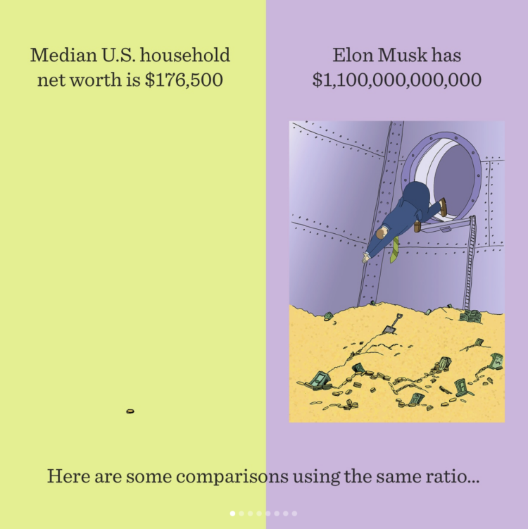
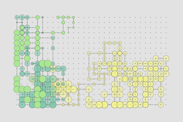
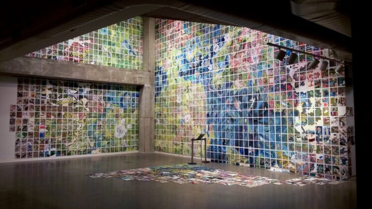
    Jerry Gretzinger started a map of a fictional city in 1963 with eight by ten-inch panels. Then he just kept going, took a break for a couple decades, and then resumed the work.

    Years later, the Map is now a two-dimensional “virtual world” art project which is now comprised of over 4000 individual eight by ten inch panels. When assembled, these panels form an approximate circle. The panel locations are defined by N, S, E, and W coordinates that originate at the center of the circle. The locations in the matrix do not change, but the panels themselves are continually revised based on instructions drawn from the artist’s custom deck of cards.

    Its execution, in acrylic, marker, colored pencil, ink, collage, and inkjet print on heavy paper, is dictated by the interplay between an elaborate set of rules and randomly generated instructions.

    I love these kind of long-term, hand-crafted projects. I’m wondering what a visualization equivalent would be using real data.

    [via Waxy]

  • Members Only

    Great expectations

    June 18, 2026

    Topic

    The Process  /  expectations, questions

    This week, we set expectations in analysis to better prepare for the unexpected.

  • Comparing today’s temperature against historical averages

    June 18, 2026

    Topic

    Statistical Visualization  /  climate, Reuters, temperature

    When you have that feeling that today is abnormally hot or cold for the time of year, historical context is useful to see if intuition matches reality. Reuters has you covered with a climate monitor that shows global temperature against a normal year.

    The dashboard view has an interactive globe, the now familiar multi-line chart that aligns past years by day, and a time series by continent.

  • Scale of a one-trillion-dollar pile of money

    June 17, 2026

    Topic

    Infographics  /  money, NBC News, scale, SpaceX

    Going with the old school pile o’ money, NBC News illustrated the scale of the SpaceX IPO valuation against the Statue of Liberty, something that we know is quite large.

    In the above, each block represents one million dollars, so a smaller denomination would make a bigger pile. And as of this writing, the market value for SpaceX is substantially higher. I’m no expert in company valuation, but this feels not ideal long-term.

  • Weakened relationships through the pandemic

    June 16, 2026

    Topic

    Infographics  /  Alvin Chang, pandemic, relationships

    The pandemic tested the strength of many relationships. Alvin Chang, for the Pudding, examined who stayed together and who did not over that time period. Divorce and separation were more common than usual.

    At the end, you can explore the data and view the responses from each person. Plus claymation.

    The project is based on the How Couples Meet and Stay Together dataset from researchers at Stanford University. Every few years they’ve run the survey, following up with the original respondents, which provides a longitudinal view of individual relationships. It’s one of my favorite datasets.

  • Proposed arch in the path of air traffic

    June 15, 2026

    Topic

    Infographics  /  arch, flights, New York Times

    The current proposal for the arch sets the height at 288 feet above sea level. The New York Times mapped air traffic in the Washington, D.C. area to show why that’s an issue.

    Among maps that show flight paths from above, a view from ground level shows how close flights from April 2026 would have gotten if the arch existed. The view rotates 360 degrees and makes the distance from arch to air traffic more obvious.

  • What $1 trillion buys

    June 12, 2026

    Topic

    Infographics  /  Bloomberg, Elon Musk, illustration, net worth, scale

    Elon Musk became the world’s first trillionaire with the SpaceX initial public offering today. For Bloomberg, Ben Steverman, with illustrations by Tim Enthoven, provides a quick ridiculous overview of what $1 trillion gets you.

    See also the Chalabi classic on Jeff Bezos wealth.

  • Apocalypse warning system, based on fleeing private jets

    June 12, 2026

    Topic

    Maps  /  apocalypse, flights, Kyle McDonald

    The Apocalypse Early Warning System by Kyle McDonald was built on the premise that rich folks will use their private jets to get out quick in case of a global emergency.

    This site watches a fixed cohort of business jets and asks a simple question: is the number currently airborne unusual for this time? It is not tracking all aircraft. The original version used an FAA-only business-jet list. The current tracker builds a broader global aircraft metadata table by merging ADS-B Exchange aircraft records, Mictronics/tar1090 records, and FAA registry data by ICAO hex. The importer classifies metadata into business jets, military aircraft, large airliners, regional airliners, non-jet aircraft, and other known types, then applies a practical business-jet filter. Each tracked aircraft is matched in live data by its ICAO hex identifier.

    I think this is only partially tongue-in-cheek? Data is updated every half hour and you can sign up for updates through Telegram or text.

  • Solar passes coal for US electricity

    June 12, 2026

    Topic

    Statistical Visualization  /  coal, difference, Ember, solar

    Another recent flip: Based on estimates from Ember, monthly solar-generated electricity reached an all-time high in May and coal reached an all-time low in April. It looks like it won’t be long until both solar and wind consistently beat coal.

  • Flip in win probability for Knicks vs. Spurs

    June 11, 2026

    Topic

    Statistical Visualization  /  basketball, Inpredictable, probability, wins

    Speaking of when data flips, last night in game four of the 2026 NBA Finals, the New York Knicks were down by as much as 29 points to the San Antonio Spurs. According to Mike Beuoy of Inpredictable, there was a less than 5% chance of the Knicks winning by the middle of the second quarter. With nine minutes left, the Knicks had a less than 1% chance.

    Then began the biggest collapse in NBA Finals history by the San Antonio Spurs.

  • Members Only

    Showing when the data flips

    June 11, 2026

    Topic

    The Process  /  difference, highlight

    This week, we focus on when there is a sudden change or flip in the data that you want to highlight.

  • Elon Musk’s promise achievement rate over the years

    June 11, 2026

    Topic

    Statistical Visualization  /  Elon Musk, goals, New York Times

    The New York Times counted Elon Musk’s promises on X/Twitter and Tesla earnings calls since 2011. Over the years, there have been more declarations, but the number of achievements per year changed little in the past five years. Instead, the rate of non-achievements appears to be rising.

  • Page 1 of 420
  • 1
  • 2
  • 3
  • 4
  • 5
  • 6
  • ...
  • 420
  • >

Get access to courses, tutorials, and more resources.

Become a member →

Recently for Members

June 25, 2026
Visualization tools, resources, and datasets — June 2026 roundup

June 18, 2026
Great expectations

June 11, 2026
Showing when the data flips

June 4, 2026
Visualization is not the goal

May 28, 2026
Visualization tools, resources, and data, May 2026 roundup

Second Edition

Visualize This: The FlowingData Guide to Design, Visualization, and Statistics (2nd Edition)

New tools, refined process.

Order: Amazon / Bookshop

Browse by Chart Type See All →

Force-Directed Graph Dumbbell Chart Step Chart Sankey Diagram Square Pie Chart Beeswarm Dot Map Spike Map Mosaic Plot Bar Chart Race

Browse By Topic

  • Visualization

    Seeing data

  • Maps

    Seeing geographic data

  • Infographics

    Explaining data

  • Networks

    Connecting data

  • Statistics

    Analyzing data

  • Software

    Working with data

  • Sources

    Getting data

  • Design

    Making data readable

Made by FlowingData

  • The Process

  • Data Underload

  • Chart Everything

  • Guides

  • Books

  • Shop

  • About
  • Contact
  • LinkedIn
  • Bluesky
  • Instagram
  • RSS
Copyright © 2007-Present FlowingData. All rights reserved.