Walk into a boba shop and usually you’ll see a large menu that…
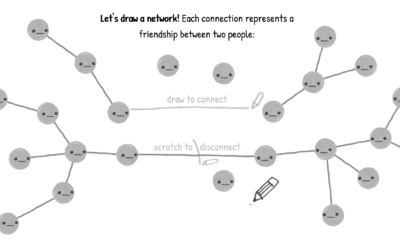
Network Visualization
Fun with links, nodes, and edges.
-
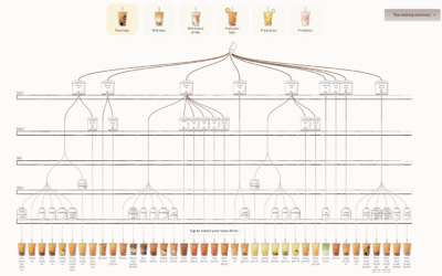
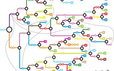
Bubble tea combinations, a visual breakdown
-
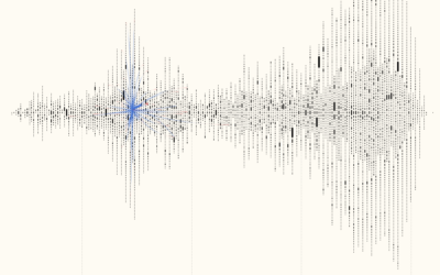
Visualizing 16th century letter correspondence of the Tudor government
Kim Albrecht, Ruth Ahnert, and Sebastian Ahnert visualized the network of communications over…
-
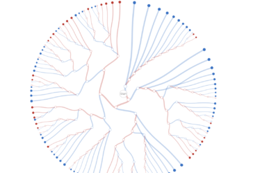
Decision tree for the presidential election result
While we’re on the topic of election scenarios, Kerry Rodden provides a radial…
-
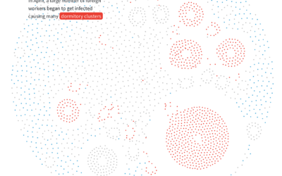
Anatomy of an outbreak
For Reuters, Manas Sharma and Simon Scarr animated a coronavirus outbreak in Singapore…
-
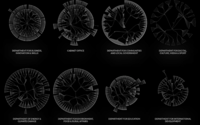
UK government org charts
When I think government structure, I tend to think in general overviews where…
-
Interactive explainer for how disease and ideas spread through a network
Kevin Simler uses interactive simulations to explain how things — ideas, disease, memes…
-
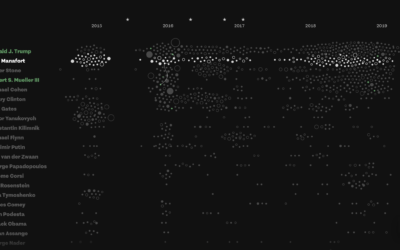
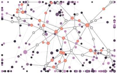
Connections and patterns in the Mueller investigation
While we’re on the subject of distributions, Fathom used a collection of beeswarm…
-

Distorting geography to show train travels
Jan Willem Tulp visualized train travel times using distance and color as an…
-

Recursive painting in real life
It started with a mom holding her painting of a bird. Then someone…
-
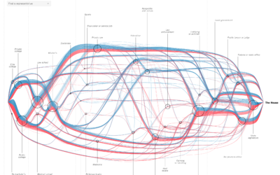
See every member’s path to the House of Representatives
For The New York Times, Sahil Chinoy and Jessia Ma visualized the path…
-
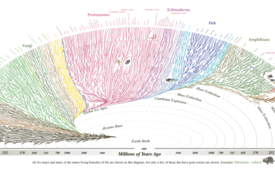
Tree of Life
From Evogeneao:
This Tree of Life diagram is based primarily on the evolutionary… -
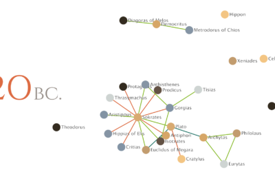
Relationships between philosophers over time
Maximilian Noichl visualized the relationships between philosophers from 600 B.C. to 160 B.C.:…
-
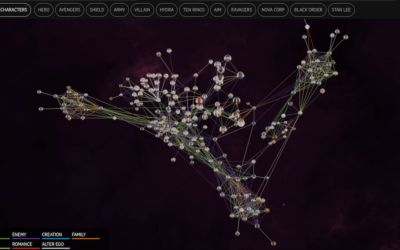
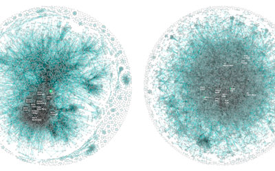
Marvel Cinematic Universe as a 3-D network
The Straits Times visualized the Marvel Cinematic Universe with a 3-D browsable network.…
-
A game to better understand the wisdom (and madness) of crowds
You’ve probably heard of the wisdom of crowds. The general idea, popularized by…
-
Mappings for Choose Your Own Adventure books
Every now and then there’s a visual exploration of the Choose Your Own…
-
How disinformation spreads in a network
Disinformation is kind of a problem these days, yeah? Fatih Erikli uses a…
-
Apple vs. Google company structure, as seen through patents
For Co.Design, Periscopic compared patent ownership between Apple and Google, which ends up…
-
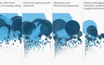
How much the US imports from Mexico
Most goods imported from Mexico are untaxed under the North American Free Trade…
Recently for Members
Second Edition
 Visualize This: The FlowingData Guide to Design, Visualization, and Statistics (2nd Edition)
 Visualize This: The FlowingData Guide to Design, Visualization, and Statistics (2nd Edition)
New tools, refined process.
Browse by Chart Type See All →


