With a surprise to nobody, Kyle Cheney for Politico:
Two members of Elon…
Statistics
More than mean, median, and mode.
-
Justice Department says DOGE might have used Social Security data for political purposes
-
Americans are paying for tariffs
For the Wall Street Journal, Tom Fairless reports on research from the Kiel…
-

Names most likely to appear in the middle
What is the most middle name in the United States? Erin Davis grew…
-
Losing American data
For Bloomberg, Molly Smith reports on the state of government data:
But Trump… -
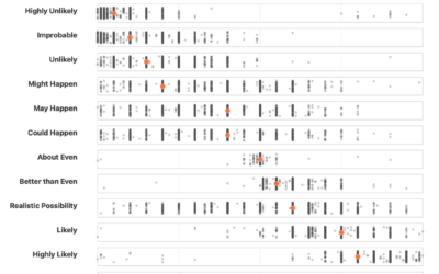
Your interpretation of uncertainty language compared
Probability expressed as a percentage is a value between 0% and 100%. If…
-
DOGE hiring and non-hiring data
In efforts to understand the hiring and firing at the beginning of the…
-
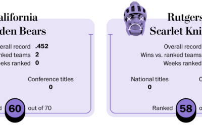
College football happiness rankings
For the Washington Post, Emily Giambalvo, Kati Perry, and Artur Galocha, ranked college…
-

Getting stuck in the mental health section of the TikTok algorithm
The Washington Post analyzed TikTok usage, finding what topics the algorithm nudges users…
-
Zillow removed climate risk scores, because property-level modeling is not foolproof
When Zillow removed climate risk scores from property listings, many assumed the company…
-
Database of mound charging in baseball
Jon Bois of Secret Base is working on a documentary that covers the…
-

Non-profit takes over a canceled NOAA database
In May, NOAA’s disaster database was canceled because it is related to climate.…
-
Decisions without data
For Bloomberg, Jarrell Dillard and Michael Sasso report on the effects of the…
-
Statistics to find cheating sports gamblers
NBA basketball players, most notably Terry Rozier, were arrested for illegal sports betting.…
-
Lack of data during the shutdown, globally
While the government shutdown pauses data about the United States, other countries feel…
-
ICE planning a surveillance system that integrates more data streams and 24/7 monitoring
Dell Cameron, for Wired, on the system currently in its planning phase:
Throughout,… -
LinkedIn sues company for fake bots
Suzanne Smalley reporting for The Record:
Social media giant LinkedIn on Thursday filed… -

Census data down
Due to the government shutdown, parts of the Census Bureau site, where you…
-
Trust and transparency in government data
Speaking of the BLS, economist David Wessel joins Jonathan Schwabish on the PolicyViz…
-
Fired BLS chief on how the day happened
Erika McEntarfer, the former chief for the Bureau of Labor Statistics made her…
-
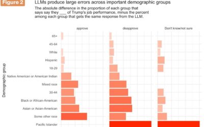
Real polling asks real people, unlike synthetic sampling
Synthetic sampling uses models to “survey” fake respondents. G. Elliott Morris and Verasight…
Recently for Members
Second Edition
 Visualize This: The FlowingData Guide to Design, Visualization, and Statistics (2nd Edition)
 Visualize This: The FlowingData Guide to Design, Visualization, and Statistics (2nd Edition)
New tools, refined process.
Browse by Chart Type See All →


