A challenge of using geographic maps to show data is that larger regions…
Apps
Software that makes a part of your data job easier.
-
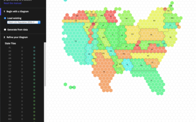
Make your own tiled cartograms
-
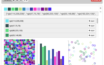
Colorgorical generates color schemes for you
Sometimes you need a color scheme quick, and ColorBrewer is typically the de…
-
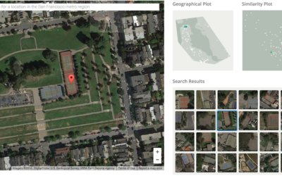
Visual search tool for satellite imagery
Terrapattern is a fun prototype that lets you search satellite imagery simply by…
-
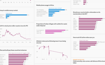
Quartz Atlas opening up to creators
Last year Quartz announced Atlas, which was a place to find all of…
-
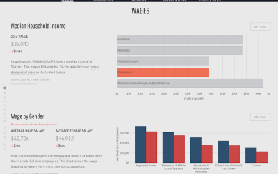
Data USA makes government data easier to explore
Government data is, shall we say, not the easiest to use and look…
-
Suite of data tools for beginners, focused on fun
Data can be intimidating and confusing for beginners, and as a result they…
-
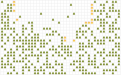
Simulate the world as an emoji system of rules
We tend to think of life in terms of cause and effect. Do…
-
An uncertain spreadsheet for estimates
A lot of data you get are estimates with uncertainty attached. Plus or…
-
Link
The Distillery →
A mini-app from Shan Carter to convert GeoJSON to TopoJSON. Simplify geometry and change projections along the way.
-
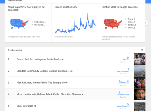
Google Trends in real-time
Google Trends used to be a place where you looked up trends for…
-
CSV Fingerprint: Spot errors in your data at a glance
You get your CSV file, snuggle under your blanket with a glass of…
-
Learn regular expressions with RegExr
Learning regular expressions tends to involve a lot of trial and error and…
-
Raw, a tool to turn spreadsheets to vector graphics
Sometimes it can be a challenge to produce data graphics in vector format,…
-
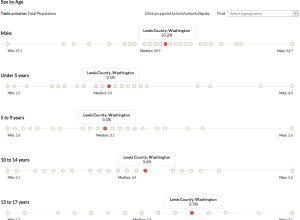
Easier Census data browsing with CensusReporter
Census data can be interesting and super informative, but getting the data out…
-
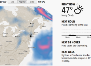
Forecast: A weather site that’s easier to read
When you go to one of the major sites to look up the…
-
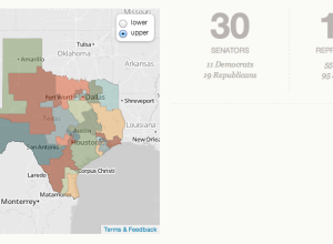
Learn about politics in your state with Open States
It’s not especially straightforward to know or find out what’s going on with…
-
Link
Geocoding in Google Spreadsheets →
Nifty trick that uses Mapquest API as source
-
Link
iWantHue →
Automatically make a color palette based on color space
-
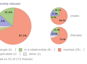
Analyze your Facebook profile with Wolfram|Alpha
Feeding off the momentum from Stephen Wolfram’s personal analytics earlier this year, Wolfram|Alpha…
-

More infographic software
Recently there’s been a spate of infographic tools popping up (e.g., easel.ly, venngage,…
Recently for Members
Second Edition
 Visualize This: The FlowingData Guide to Design, Visualization, and Statistics (2nd Edition)
 Visualize This: The FlowingData Guide to Design, Visualization, and Statistics (2nd Edition)
New tools, refined process.
Browse by Chart Type See All →


