For The New York Times, K.K. Rebecca Lai and Jennifer Medina show the…
Infographics
Telling stories with data and graphics.
-

Evolution of race categories in U.S. Census forms
-
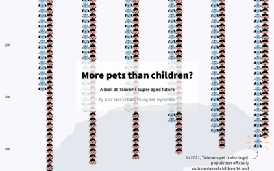
More pets than children in Taiwan
Julia Janicki, Daisy Chung, and Joyce Chou explore Taiwan’s aging population, where in…
-

Tree rings to compare life expectancy in your state
The Washington Post goes with a tree ring metaphor to compare life expectancy…
-
Visual explanation of menstrual cycle length and variability
For the Apple Women’s Health Study, which uses cycle tracking data from iPhones…
-

Loneliness, life satisfaction, and time
For The Pudding, Alvin Chang examines loneliness through the lens of individual responses…
-
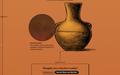
Evolution of beer
Beer dates back thousands of centuries, but it was not the beer we…
-

Twitter slows competitor links
When you click a link on Twitter, you go through a Twitter shortlink…
-

Cooling a city
Tall buildings in dense cities can trap heat and restrict air flow, which…
-
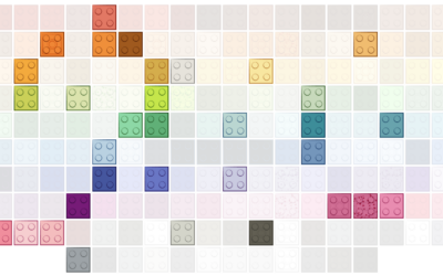
Evolution of Lego brick colors
Lego started with five brick colors: red, yellow, blue, white, and clear. The…
-

Clock plays a song with the current time in its title
For The Pudding, Russell Samora pulled songs via the Spotify API and made…
-

Infinity abstractions
Infinity is an abstraction of endlessness, which seems to suggest that it cannot…
-

Explorable explanation for matrix transformations
Instead of using a bunch of equations to memorize, Yi Zhe Ang visually…
-

Using cold lake water to cool buildings
There are buildings in Toronto, Canada that make use of a deep lake…
-

Passenger planes flying too close
Sometimes passenger planes get a little too close to each other on takeoff…
-

xkcd: Pairwise matrix of what to do in an emergency
xkcd has an informative reference for what do in case of mountain lion…
-

Hip-hop’s influence on the English language
For The New York Times, Miles Marshall Lewis highlights the etymology of five…
-
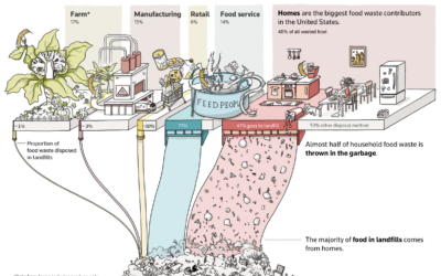
Greenhouse gas from wasting food at home
Almost half of wasted food comes from homes, and almost half of that…
-

Rarity of songwriters who are women for popular songs
It’s common to see singers who are women, but the people who write…
Recently for Members
Second Edition
 Visualize This: The FlowingData Guide to Design, Visualization, and Statistics (2nd Edition)
 Visualize This: The FlowingData Guide to Design, Visualization, and Statistics (2nd Edition)
New tools, refined process.
Browse by Chart Type See All →


