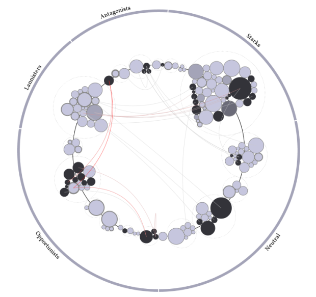
This one’s for you Game of Thrones fans and aficionados. Jerome Cukier visualized groups of people, from Lannisters to Starks, and kills throughout the books. Each circle represents a character and is sized by number of appearances. Color represents status, and connecting lines are killer-killee relationships (aw, so sweet). The best part is that this all plays out over time.
Second Edition
 Visualize This: The FlowingData Guide to Design, Visualization, and Statistics (2nd Edition)
 Visualize This: The FlowingData Guide to Design, Visualization, and Statistics (2nd Edition)
New tools, refined process.
Link is not working! ):
Working okay for me…