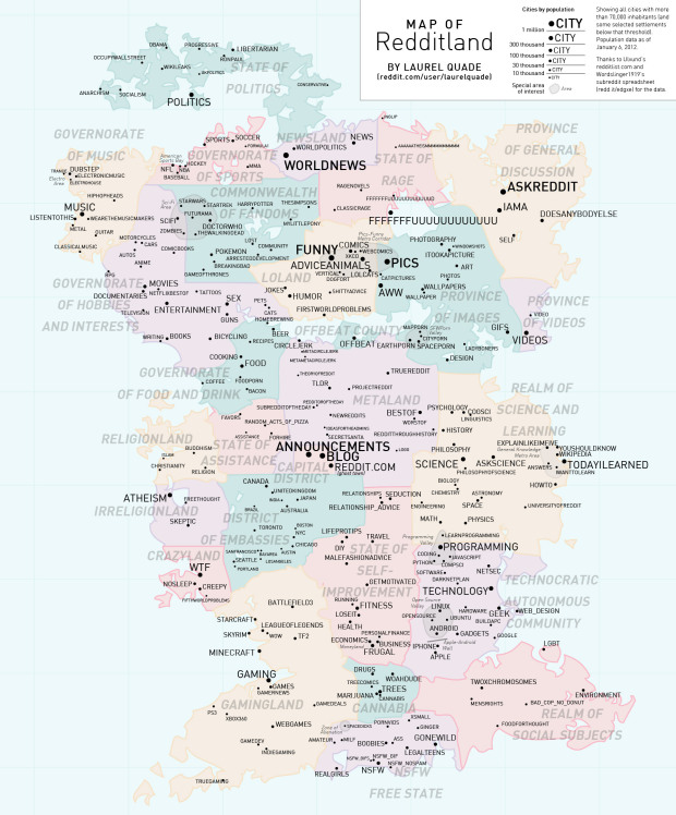
Reddit user Laurel Quade mapifies the wonderful world of Reddit. Each country represents an area of interest, and “cities” are sized by inhabitants. I’m not familiar enough with the communities to know how accurate it is, but judging by the comments, I’d say pretty good.
[Redditland via @adamsinger]
 Visualize This: The FlowingData Guide to Design, Visualization, and Statistics (2nd Edition)