How to Make Animated Line Charts in R
Sometimes it’s useful to animate the multiple lines instead of showing them all at once.

Animated line charts have limited applications, but in some cases, they can be useful to see change. A few years ago, Ed Hawkins showed this by visualizing global temperature:
Spiralling global temperatures from 1850-2016 (full animation) https://t.co/YETC5HkmTr pic.twitter.com/Ypci717AHq
— Ed Hawkins (@ed_hawkins) May 9, 2016
Bloomberg did it too a bit earlier by drawing a line for each year. As the years play out, you can see overall temperature rising overall.
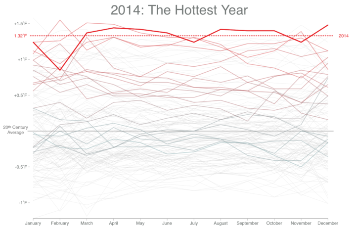
In this tutorial you learn to make charts that look more like this Bloomberg piece. You use R and the animation package to make an animated GIF, but first you start with static charts and then work your way towards the finished graphic.
To access this full tutorial, you must be a member. (If you are already a member, log in here.)
Get instant access to this tutorial and hundreds more, plus courses, guides, and additional resources.
Membership
You will get unlimited access to step-by-step visualization courses and tutorials for insight and presentation — all while supporting an independent site. Files and data are included so that you can more easily apply what you learn in your own work.
Learn to make great charts that are beautiful and useful.
Members also receive a weekly newsletter, The Process. Keep up-to-date on visualization tools, the rules, and the guidelines and how they all work together in practice.
See samples of everything you gain access to:
About the Author
Nathan Yau is a statistician who works primarily with visualization. He earned his PhD in statistics from UCLA, is the author of two best-selling books — Data Points and Visualize This — and runs FlowingData. Introvert. Likes food. Likes beer.


