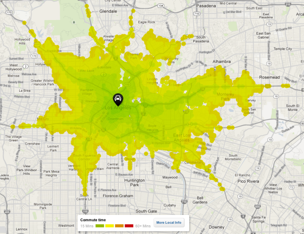
When you look for a place to live, there are outside factors to consider other than price and square footage. You want to know what the area is like. How’s the crime? Are the schools nearby good or bad? Housing search site Trulia provides this information with Trulia Local. Using data from OpenStreetMaps and General Transit Feed Specification feeds, it just got better with their most recent addition that maps commute times.
Commuting sucks. It’s stressful, and no amount of Sirius radio can make a traffic jam fun. Because of this, we know that commuting is an important consideration when choosing where to live, whether you’re in Los Angeles or Boston. So, launching today is Trulia’s first iteration of the Commute Map, a way to visualize driving and public transit times. With this new product, we aim to give Trulia users a better understanding of commute times to work or anywhere important, to help them find the best place to live.
Put in your location, and the heatmap indicates areas you can get to in less than thirty minutes. If you want to see places farther away, you can use the slider to adjust the time, up to an hour away.
I found myself just punching in addresses for fun and emphatically dragging the slider back and forth. The map is responsive, and most importantly informative, especially if you’re planning a move.


What I’ve been juggling in my head for quite a while now is a map that distorts the spatial dimensions according to commute times. The resulting map should show every place B1..Bn that you can reach from point A in the same amount of time t with the same distance to A.
It would probably be a challenge to keep it readable even if you don’t know the area very well. But I would love to see such a map.
Tom Carden did something like that for the London Tube Map, although it doesn’t seem to be working right now:
http://www.tom-carden.co.uk/p5/tube_map_travel_times/applet/
We did a static map like that for NYC commuter rail lines — LIRR, Metro-North, NJ Transit — a few years ago.
http://www.nytimes.com/imagepages/2007/03/17/nyregion/nyregionspecial2/20070318_TRAIN_GRAPHIC.html
The one we did is just train lines, but would be fun sometime to try and rubbersheet a geographic map underneath it, also, so you could see things like coastlines and state boundaries and such distort, too.
It’s not entirely accurate. I’d say on average it’s about 15 mins over. It shows my commute as around 60 mins when realistically it’s 45 tops. It also shows that a location about 5 miles from my house takes 25-30 mins to get to. Realistically, it’s 10-15 at most.
Totally agree with Kyle. My commute shows up between 85 – 95 minutes. It actually takes me 45 minutes.
It’s also super annoying to me that I can’t zoom out far enough to see my entire area for a 1-hour commute.
Cool product. It’s a shame it doesn’t work very well. My commute takes 9 minutes each way. The map reports it at 16 minutes. Interestingly, for my previous, freeway only commute it actually did a pretty good job. Perhaps they need to recalibrate the thing to assume higher speeds on surface streets than it does.
It’s not even close for me. My commute is <25 mins but the estimate is 55-60.
Does anybody know what the traffic information source is? INRIX?
I think it’s only using average speeds for roads, and not taking into account time of day. I know that in the San Jose area, heading N on 85 is gridlocked in the morning, but fine in the evening, and it seems to be kind of optimistic.
@EmmJay, I’ve seen a map like that, but it was for train commuting. Somewhere in Europe, possibly Belgium or the Netherlands.
This is pretty much useless without time-of-day data. In Seattle, that 15 minute commute is actually 60+ minutes during rush hour, which is the important part.
I see this as more of a fuzzy map for home-searching. When you’re looking for a house or an area to live in, you want a general idea of where you can go and what’s around. Then when you have something really specific in mind, you can head over to Google Maps. So while traffic would be great to incorporate, I think the map can still be useful in its setting.
Cool visualization. It’d be great to see commute times based on traffic, which is always a factor.
As others have commented, its accuracy is suspect. It is giving times that are about 40% over my worst case (rush hour with construction) for Milwaukee.
I just wish it had the bike commute times, too.