SF Signal constructs a big arse flowchart to help you sift through NPR’s…
2011 September
-
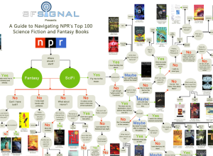
Flowchart: Which of NPR’s top 100 science fiction and fantasy books should you read?
-
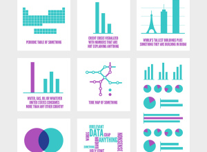
Most popular infographics generalized
Yep, still amusing. [via]…
-
The Many Words for Visualization
There are a lot of words to describe visualization and visualization-related things. It…
-

Live data wall and immersive film at THINK exhibit
The THINK exhibit from IBM just opened up at Lincoln Center in New…
-
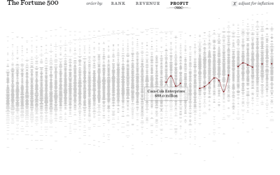
The Fortune 500, 1955 to 2010
Since 1955, Fortune Magazine has published a list of America’s 500 largest companies.…
-

Deleted Geocities archive visualized as city
In a time long ago, there existed a place on the Internet called…
-
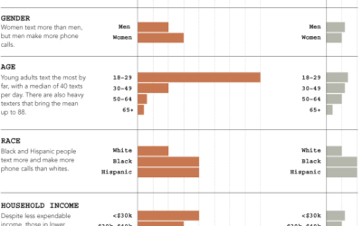
Who does all the text messaging? Young adults by far.
The Pew Internet and American Life Project published the results of their texting…
-
5 misconceptions about visualization
Last month, I had the pleasure of spending a week at the Census…
-
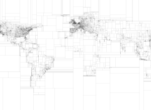
Rectangular subdivisions of the world
Eric Fischer, who continues his string of mapping fun and doesn’t even do…
-

Musical spectrum analysis
Jon-Kyle Mohr visualizes the musical spectrum of a song in this mesmerizing video.…
-

Imager shows cross-sections of everyday objects – analog version
GE shows how their body imaging technology can take detailed pictures of insides…
-
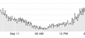
Quick time series visualization with Cube
Seeing how things change over time can be important for a business so…
-
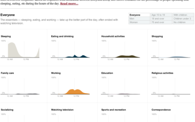
How do Americans spend their days?
One of my favorite data graphics is an interactive piece by The New…
-
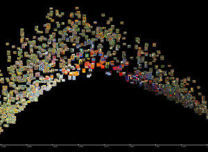
Explore large image collections with ImagePlot
When we make charts and graphs, we usually think of the data abstractions…
-
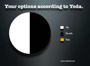
Yoda pie chart
“Do or do not. There is no try.” — Yoda [via]…
-
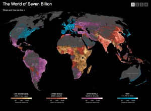
World population densities mapped
National Geographic has a look at where and how we live:
The map… -

Smart people talk about art and data
A few months ago, a packed crowd gathered in Minneapolis for the Eyeo…
-
BBC Knowledge
This is totally sunshine and lollipops, but it has a good flow to…
-
PDF data woes
We do not provide these tables in Excel or CSV format. You will…
-

The United Kingdom of McDonald’s
In a follow-up to his ever popular McMap that showed distance to the…
Recently for Members
Second Edition
 Visualize This: The FlowingData Guide to Design, Visualization, and Statistics (2nd Edition)
 Visualize This: The FlowingData Guide to Design, Visualization, and Statistics (2nd Edition)
New tools, refined process.
Browse by Chart Type See All →


