2011 May

  • Anatomy of a mashup

    May 16, 2011 to Visualization  •  Share on Twitter  •  Comments (3)

    Daft Punk

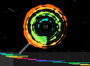
    Mashups, the art of mixing multiple songs into one continuous song, is a subtle art. When a mashup is done well, you often can't hear all of the different songs merging into one, because it's so fluid. Cameron Adams, aka The Man in Blue, visualizes his own mashup Definitive Daft Punk, to show just what goes into the piece.
    Continue Reading

  • Plush statistical distribution pillows

    May 13, 2011 to Statistics  •  Share on Twitter  •  Comments (3)

    Distribution pillows

    For the statistical nerd in you or for the child you are raising as one, Nausicaa Distribution on Etsy sells handmade gifts inspired by statistical distributions. Above shows the dastardly gang of five evil distribution plushies: Weibull, Cauchy, Poisson, Gumbel, and Erlang. Judging by their moustaches, you better watch out when they're around.
    Continue Reading

  • Ben Fry on visualization future and data literacy

    May 13, 2011 to News  •  Share on Twitter  •  Add Comment

    Ben Fry, co-creator of Processing and head of Fathom Design, talks data visualization with O'Reilly Radar editor Mac Slocum. When asked about the concern over visualization and analysis getting into amateur hands:

    I think it’s kind of funny… The same argument has been made with any technological leap since the beginning of time. Books printed in mass had a similar reaction. The internet came along and everybody could post things on the internet and wouldn’t that be the end of the world… The important thing is to focus on the literacy aspect of it. The more that people are doing the work — it all kind of goes to improve the conversation of what’s good, bad useful and what’s not.

    When asked how he sees visualization developing over the next couple of years:

    I think the real thing that's going to change is that we're going to start understanding that visualization isn't this sort of monolithic thing... I like to look at it a lot like writing. You have novels and poetry and haikus. You know there's lots of different types of writing and styles of writing — and I think the same thing happens in visualization... some things are tools for analysis and some things are purely for entertainment, and there's not so much a spectrum that there is different ways of addressing it.

    Watch the short eight-minute interview below. There are some other interesting soundbites in there. I especially like the tidbit at the end about snippy discussions within the visualization sphere. Similar sentiments in a recent Q&A with Moritz Stefaner.
    Continue Reading

  • Art reproduction incongruencies

    May 12, 2011 to Data Art  •  Share on Twitter  •  Comments (1)

    21-tears_bigger

    When you think art reproduction, you probably think of something that looks almost identical to the original piece, but as Martin Wattenberg and Fernanda Viegas show in The Art of Reproduction, factors such as color and size can vary a lot:

    Curious just how far reproductions stray from each other, we began an investigation... For a set of famous artworks, we downloaded all the plausible copies we could find. Then we wrote software to reconstruct each artwork as a mosaic, a patchwork quilt where each patch comes from an individual copy.

    The above is a mosaic of reproductions of 21 Tears by Man Ray, and as you can see, the colors across reproductions span grayscale to green. Continue Reading

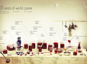
  • A century of deaths and a lot of fake blood

    May 12, 2011 to Data Art  •  Share on Twitter  •  Comments (24)

    100 years of world cuisine

    Rather than bars, bubbles, and dots, Clara Kayser-Bril, Nicolas Kayser-Bril, and Marion Kotlarski use jars, bottles, and bowls of fake blood to show deaths from 25 major conflicts in 100 years of world cuisine.

    Ten casualties. Ten million casualties. Our understanding of conflicts is often nothing more than a handful of digits, the more precise, the less meaningful. The anchor’s tone remains the same when talking about major wars or isolated outbursts of violence. The horror lays hidden beneath the rigidity of numbers. Figures give us knowledge, not meaning.

    We wanted to put a picture on these digits. A shocking, gory picture, like the reality of war. We wanted to give context, like a scale on which we could visualize each conflict next to the others.

    The idea is straightforward. More blood = more deaths during the corresponding conflict. What do you think—does the medium make the data more meaningful?

    The graphic is also available in print.

    [100 years of world cuisine via @moritz_stefaner]

  • Mapping connections with great circles

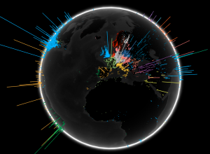
    How to map connections with great circles

    There are various ways to visualize connections, but one of the most intuitive and straightforward ways is to actually connect entities or objects with lines. And when it comes to geographic connections, great circles are a nice way to do this.
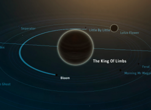
  • Ben Cerveny talks Planetary and where they go next

    May 11, 2011 to News  •  Share on Twitter  •  Comments (1)

    Planetary

    Planetary, the iPad app for music exploration by Bloom, has hit the ground running. Out only a few days now, Planetary is already number four on the list of top free apps. Ben Cerveny, the president of Bloom, chats on Press:Here about the app, visualization as UI, and where they go next in the video below.
    Continue Reading

  • Flash vs. HTML5

    May 10, 2011 to Infographics  •  Share on Twitter  •  Comments (202)

    Flash vs. HTML5

    Design firm Periscopic takes a look at the Flash versus HTML5 debate and some considerations you should make if you're deciding which one to use in your projects. The main conclusions: Flash lets you reach the widest audience with the drawback of not working on some mobile devices; HTML5 is still developing.

    Which one are you gonna pick for your next web project?

    [Periscopic | Thanks, Kim]

  • Global search volume by language

    May 10, 2011 to Mapping  •  Share on Twitter  •  Comments (4)

    Search by Language

    To show off their new toy that is WebGL, a 3D graphics API for JavaScript, the Google Data Arts Team maps global search volume by language:

    The Search Globe visualizes searches from one day, and shows the language of the majority of queries in an area in different colors. You’ll see a bright landscape of queries across Europe, and parts of Asia for instance, but unfortunately we see many fewer searches from parts of the world lacking Internet access—and often electricity as well—like Africa. We hope that as the Internet continues to become more accessible over time and people continue to ask questions, we’ll see this globe shine brightly everywhere.

    We've seen this sort of view before, but the interesting thing is that this runs native in the browser (and will probably send your fan whirling). Rotate and zoom in to your heart's content.
    Continue Reading

  • Stats of the Union tells health stories in America

    May 9, 2011 to Mapping  •  Share on Twitter  •  Comments (8)

    Uninsured under 65

    Stats of the Union, the new Fathom-produced iPad app, maps the status of health in America. Browse, pan, zoom, and explore through a number of demographics and breakdowns.
    Continue Reading

  • Where the water resources are and where they go

    May 9, 2011 to Data Art  •  Share on Twitter  •  Add Comment

    Drawing water

    Designer David Wicks compares rainfall against water consumption in his thesis project Drawing Water:

    Drawing Water is a constructed landscape shaped by the relationship between where water falls and where it’s consumed within the United States. It builds images to expose the reality that water is channeled, pumped, and siphoned to locations far from where it falls. Although the paths are imagined, Drawing Water is based on real data and it reveals a clear truth about water resources and use.

    The placement of each line represents a rainfall measurement, and the length and end placement is based on urban consumption. Lines pulled farther from its source change to black. The data comes from two sources: USGS for water consumption and NOAA/NWS for rainfall data provided.
    Continue Reading

  • FlowingData is brought to you by…

    May 9, 2011 to Sponsors  •  Share on Twitter

    My many thanks to the FlowingData sponsors who help keep this growing blog running. They help you make sense of and communicate with data. Check 'em out:

    InstantAtlas — Enables information analysts and researchers to create highly-interactive online reporting solutions that combine statistics and map data to improve data visualization, enhance communication, and engage people in more informed decision making.

    Tableau Software — Combines data exploration and visual analytics in an easy-to-use data analysis tool you can quickly master. It makes data analysis easy and fun. Customers are working 5 to 20 times faster using Tableau.

    Column Five Media — Whether you are a startup that is just beginning to get the word out about your product, or a Fortune 500 company looking to be more social, they can help you create exciting visual content – and then ensure that people actually see it.

    IDV Solutions Visual Fusion — Business intelligence software for building focused apps that unite data from virtually any data source in a visual, interactive context for better insight and understanding.

    Want to sponsor FlowingData? Contact me at sponsors@flowingdata.com for more details.

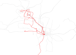
  • One man’s travel patterns – Atlas of the Habitual

    May 9, 2011 to Mapping, Self-surveillance  •  Share on Twitter  •  Comments (1)

    Atlas of the Habitual

    FInding himself in a new town, with a new job, Tim Clark started tracking his location on August 24, 2010, and ended 200 days later on March 13, 2011. Every time he stepped out, he turned on his GPS logger, and then would tag that trip with information about what it was for or what happened. Atlas of the Habitual is the result.
    Continue Reading

  • Friday freebies: Comment to win a copy of R Cookbook – winners announced

    May 6, 2011 to Contests  •  Share on Twitter  •  Comments (657)

    Want a free copy of R Cookbook by Paul Teetor? You're in luck, because I have four copies to give away, generously provided by O'Reilly. In case you're unfamiliar, here's my review for some background. Bottom line: It's a fine addition to the O'Reilly series of cookbooks.

    How to Win

    You know the drill. Simply leave a comment on this post by Sunday, March 8 at 11pm PST. This time around, let's go with... your favorite number. Yeah, tell me what your favorite number is. Then I'll choose four winners at random on Monday.

    Obviously make sure you use a valid email address, and only one entry per person please. Good luck!

    Update: Winners announced! You should have received an email if you were picked. Thanks for participating, everyone.

  • Correlating dog

    May 6, 2011 to Miscellaneous  •  Share on Twitter  •  Add Comment

    Correlation dog

    From the Doghouse Diaries. Smart dog. My cat on the other hand, still has some learning to do. Every time he scratches the couch, he looks at me like he's expecting something. I yell at him, "Causation doesn't equal correlation!" He stares back blankly.

    [Doghouse Diaries | Thanks, Seth]

  • Where America flies

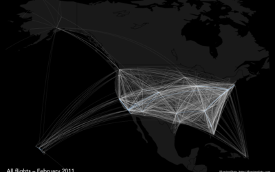
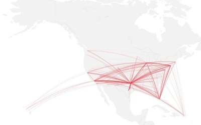
    Geographic breakdown: Where do major airlines fly?

    Ever since seeing the Facebook friendship map and later, the map of scientific collaboration, I've been looking for an excuse...
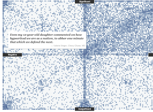
  • Reactions to the death of a terrorist

    May 4, 2011 to Statistical Visualization  •  Share on Twitter  •  Add Comment

    Death of a Terrorist - reactions

    On the announcement of Osama Bin Laden's death, there was a mixed reaction across the country. Some celebrated, whereas others had mixed feelings. Jon Huang and Aron Pilhofer for The New York Times, asked readers how they felt and to mark their thoughts on the positivity vs. significance grid.
    Continue Reading

  • Oil spill amounts in perspective

    May 4, 2011 to Infographics  •  Share on Twitter  •  Comments (6)

    Oil video

    On the one-year anniversary of the Deepwater Horizon oil spill, designer Chris Harmon puts the amount of spilled oil into perspective in this video (below). It's mostly simplified facts and figures, but most of us probably know enough about the spill already for the numbers to be interesting.
    Continue Reading

  • Science as metaphor

    May 4, 2011 to News  •  Share on Twitter  •  Comments (5)

    In this article from Science from July 1998, award-winning journalist John Banville on the similarities and differences between art and science:

    Of course, art and science are fundamentally different in their methods, and in their ends. The doing of science involves a level of rigor unattainable to art. A scientific hypothesis can be proven—or, perhaps more importantly, disproven—but a poem, a picture, or a piece of music, cannot. Yet in their origins art and science are remarkably similar. It was a scientist, Niels Bohr, who declared that a great truth is a statement whose opposite is also a great truth. Oscar Wilde would have agreed.

    It often seems like there's a chasm between the two, but there is also plenty of common ground.

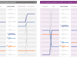
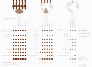
  • Perceived vs. actual country rankings

    May 3, 2011 to Infographics  •  Share on Twitter  •  Comments (4)

    Countries ranking

    Lisa Strausfeld, in collaboration with GE, compares perceived country rankings and actual ones.

    Innovation is the key driver of business and economic success. In January 2011, GE developed an Innovation Barometer based on a survey of 1000 senior business executives in 12 countries. We asked about both the drivers and impact of innovation. In this visualization, we’re taking a deeper look, enabling comparisons between what execs believe drive innovation and what’s actually happening in market.

    As seen in the image above, rankings are displayed via parallel coordinates, with actual country rankings on the left and perception on the right. The business execs were asked if they thought their country was "successful" in the categories, and the perceived rankings are based on the percentage who said yes. Each line represents a country. Roll over a country on either side to compare the patterns.
    Continue Reading

Copyright © 2007-2012 by FlowingData. All rights reserved.