Kevin Quealy and Jeremy White report for The New York Times on the…
2011 May
-
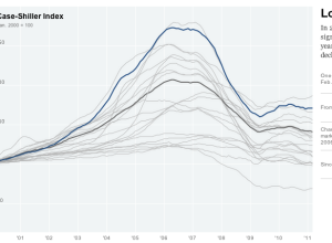
Rise and fall of housing prices
-

11.3m player deaths visualized in point cloud
Sometimes visualizing everything can turn out beautiful results. It seems to work especially…
-

Time-lapse of the night sky with the Very Large Telescope
The Very Large Telescope (VLT) in an array of four telescopes operated by…
-

Why you shouldn’t eat farmed fish – a graphical explanation
Do you know where your fish comes from? Well, yeah, it comes from…
-

Aaron Koblin on visualizing humanity
Aaron Koblin, Creative Director of Google’s Data Arts team, shares some of the…
-
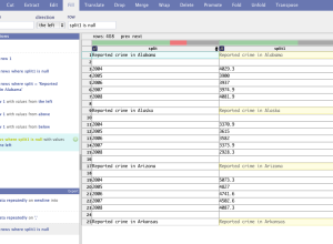
DataWrangler for your data formatting needs
Formatting data is a necessary pain, so anything that makes formatting easier is…
-

Pew Research raw survey data now available
The Pew Research churns out a lot of interesting results from a number…
-
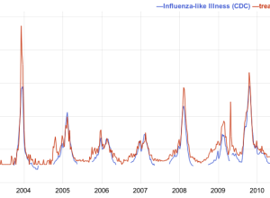
Google Correlate lets you see how your data relates to search queries
A while back, Google showed how Influenza outbreaks correlated to searches for flu-related…
-

Visualization contests around the corner
The best way to learn how to visualize data is to grab a…
-
Exploring NYT news and its authors
The IBM Visual Communication Lab published their first of what I hope many…
-
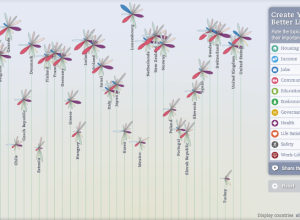
Better Life Index measures well-being across countries
OECD, with the help of Moritz Stefaner and Raureif, promote a well-being index…
-
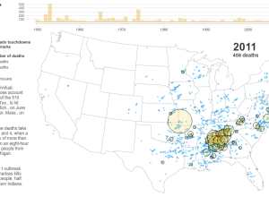
A deadly year of tornadoes
As reported by The New York Times, the tornado in Joplin, Missouri, known…
-
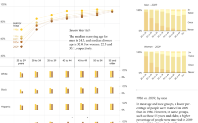
Seven year itch: When do people get married and divorced?
The United States Census Bureau just released results from the Survey of Income…
-

Data tales, revolution, and journalism
On the Media’s episode last week was on data, namely personal data collection,…
-
Growing need for data heads
The New York Times, citing a number of bits from a recent McKinsey…
-

Geography of hate
Richard Florida for The Atlantic takes a closer look at hate groups in…
-
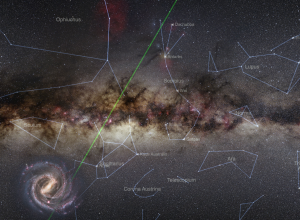
Super detailed map of the skies
The title just about says it all:
The Photopic Sky Survey is a… -
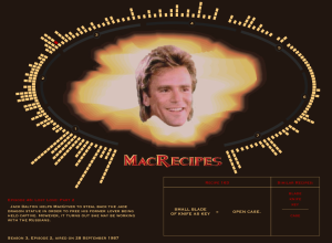
MacGyver recipe book – All 7 seasons of diversions and mischief
Oh. My. God. Fathom Information Design compiles every recipe from the show MacGyver:…
-
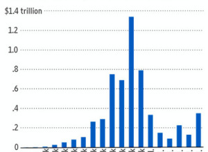
Open thread: Can you spot the wrongness in this tax graph?
The argument behind this graph in The Wall Street Journal is that the…
-

U.S. home prices as opera
Planet Money, a radio show on NPR covering the global economy, loves data,…
Recently for Members
Second Edition
 Visualize This: The FlowingData Guide to Design, Visualization, and Statistics (2nd Edition)
 Visualize This: The FlowingData Guide to Design, Visualization, and Statistics (2nd Edition)
New tools, refined process.
Browse by Chart Type See All →


