There’s a lot of talking in congressional meetings, but what are your state…
2009 July
-
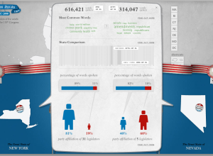
Compare What Your Senators and Reps are Talking About With Congress Speaks
-
Friday Freebies: Beautiful Data is Now Available
Beautiful Data from O’Reilly is now available! The book is a collection of…
-
Animated Infographics for the Eat Local, Eat Real Campaign
I love food. I love infographics. Put them together, and this is what…
-
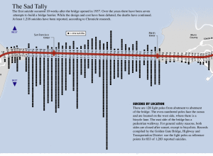
Suicides by Location on the Golden Gate Bridge
This graphic from SF Gate is a good four years old, well before…
-

Gauge Your Distraction While You Text and Drive in the Distracted Driving Game
From Gabriel Dance, Tom Jackson, and Aaron Pilhofer of the New York Times…
-
Friday Freebies: 5 E-book Copies of Beginning Python Visualization
It’s Friday! I don’t know about you, but I’m ready for the weekend,…
-

Three Ingredients to Make the Perfect Business
Thanks to Jessica Hagy and her Indexed project, we’ve seen lots of graphs…
-
Death and Taxes Poster 2010 – 50% Off for FlowingData Readers
Jess Bachman of WallStats just released his annual Death and Taxes Poster for…
-
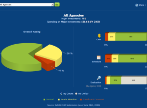
IT Dashboard and Data from USAspending.gov
Taking another step towards data transparency, the US government provides the IT dashboard…
-

Comparing the Human and Chimpanzee Genomes
As part of the Explore Evolution exhibit at the University of Nebraska State…
-

Important Data – Please Act Responsibily
Photo by nyki_m
Data visualization and infographics come in many forms. Some are…
-
Thanks to Our FlowingData Sponsors
A big thank you to our FlowingData sponsors who help keep the servers…
-
From the FlowingData Forums [July 3-17]
Visualize This: Obesity Rates by State
This segment of Visualize This is all… -
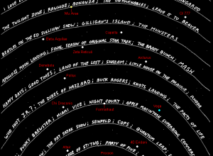
If Aliens Were Tuning Into Our Television Frequencies…
In a different take on a timeline of television, Abstruse Goose, a web…
-
Taking a Closer Look at Airplane-Bird Collisions
While we’re on the subject of flight, ever since that plane landed in…
-
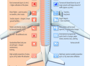
Why Are Cheap Airlines So Cheap?
5W Graphics, whose work you’ve seen by now, compares lower-cost airlines to “regular”…
-
Collect Data About Yourself with Twitter – your.flowingdata is Live
your.flowingdata (YFD), a Twitter application that lets you collect data about yourself, is…
-
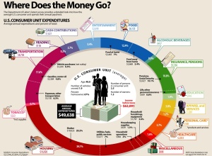
How Does the Average Consumer Spend His Money?
Add another graphic to the list of ways to show consumer spending. Visual…
-
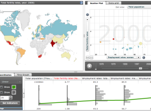
Explore World Data with Factbook eXplorer from OECD
The Organization for Economic Co-operation and Development (OECD) makes a lot of world…
-
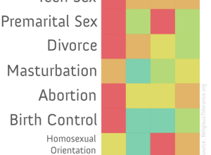
Religious Teachings On Sex
This graphic on religious teachings and sex is making the social media rounds.…
Recently for Members
Second Edition
 Visualize This: The FlowingData Guide to Design, Visualization, and Statistics (2nd Edition)
 Visualize This: The FlowingData Guide to Design, Visualization, and Statistics (2nd Edition)
New tools, refined process.
Browse by Chart Type See All →


